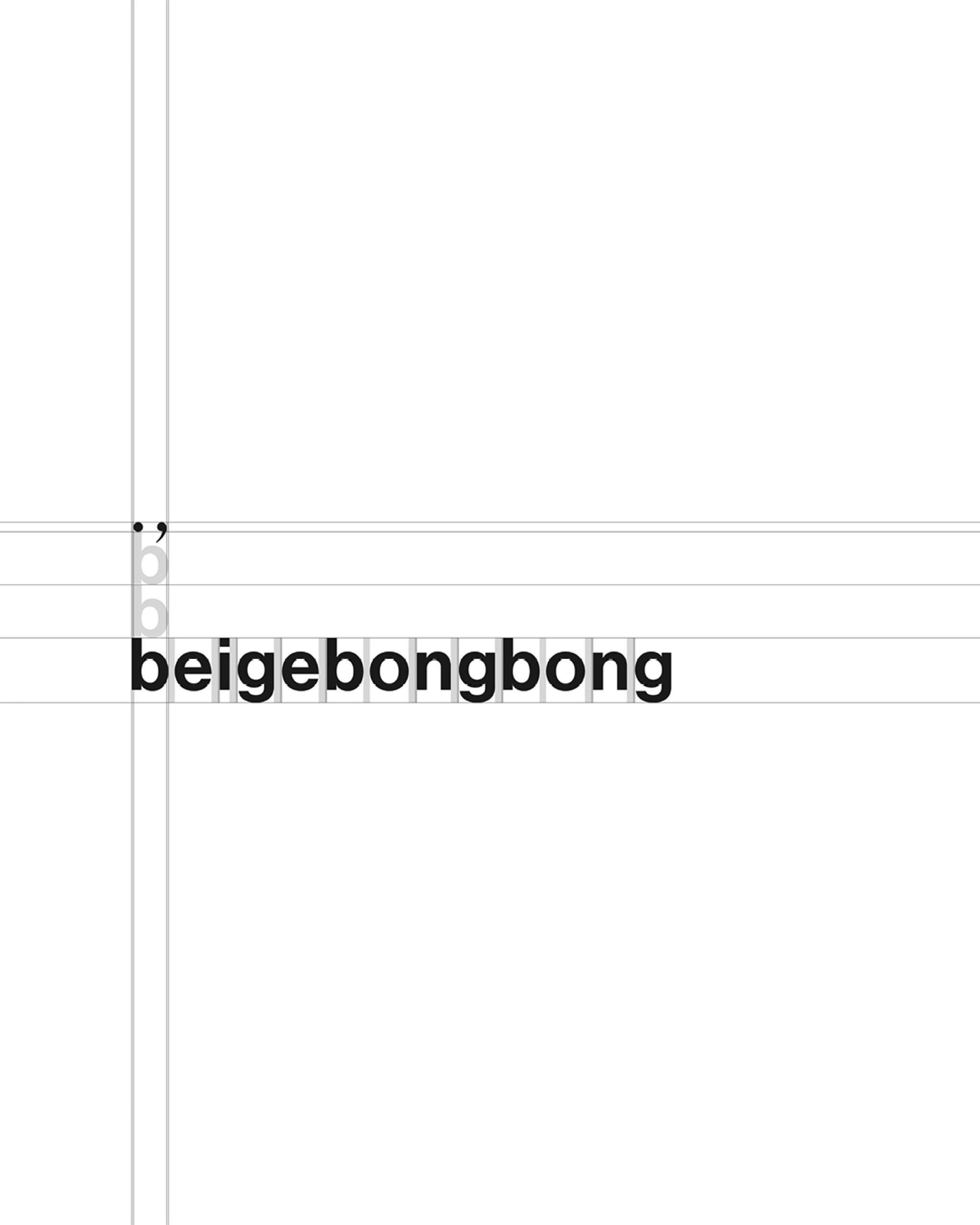
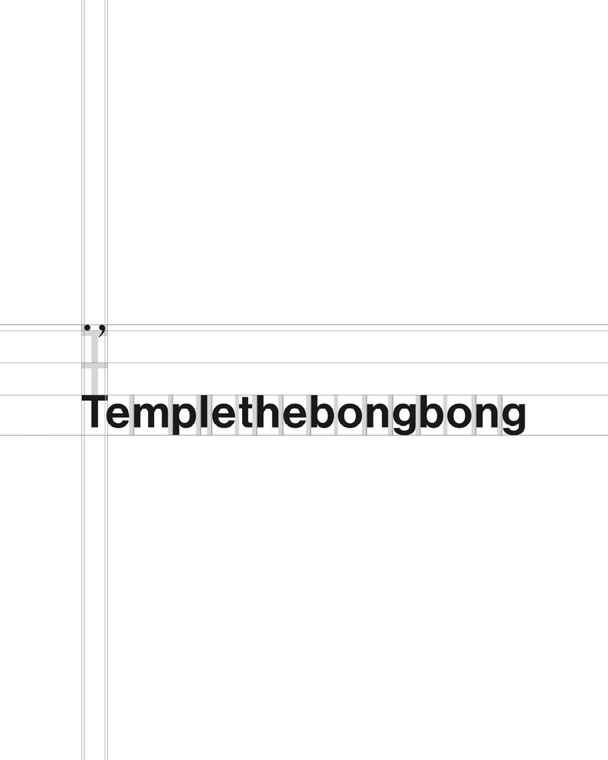
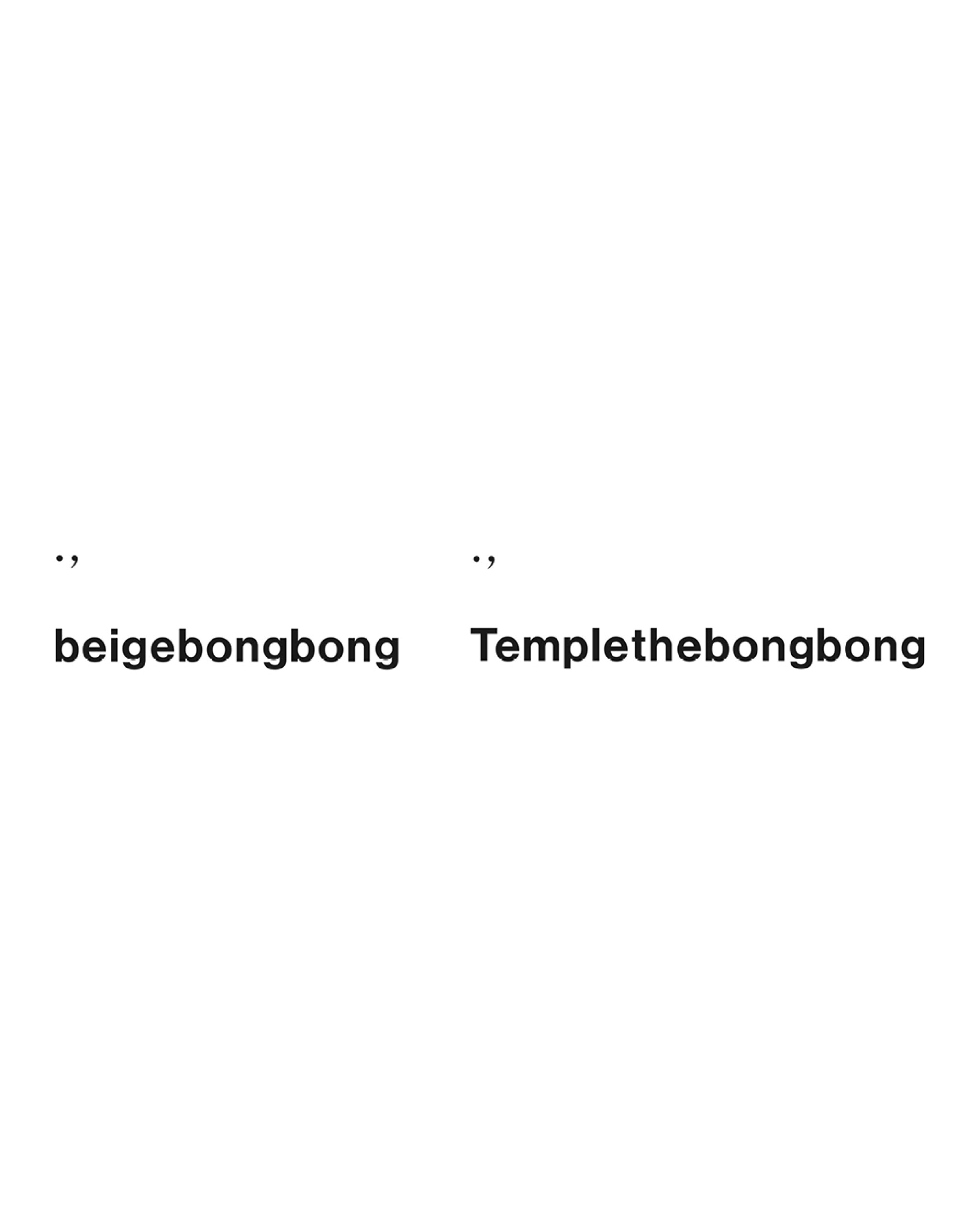
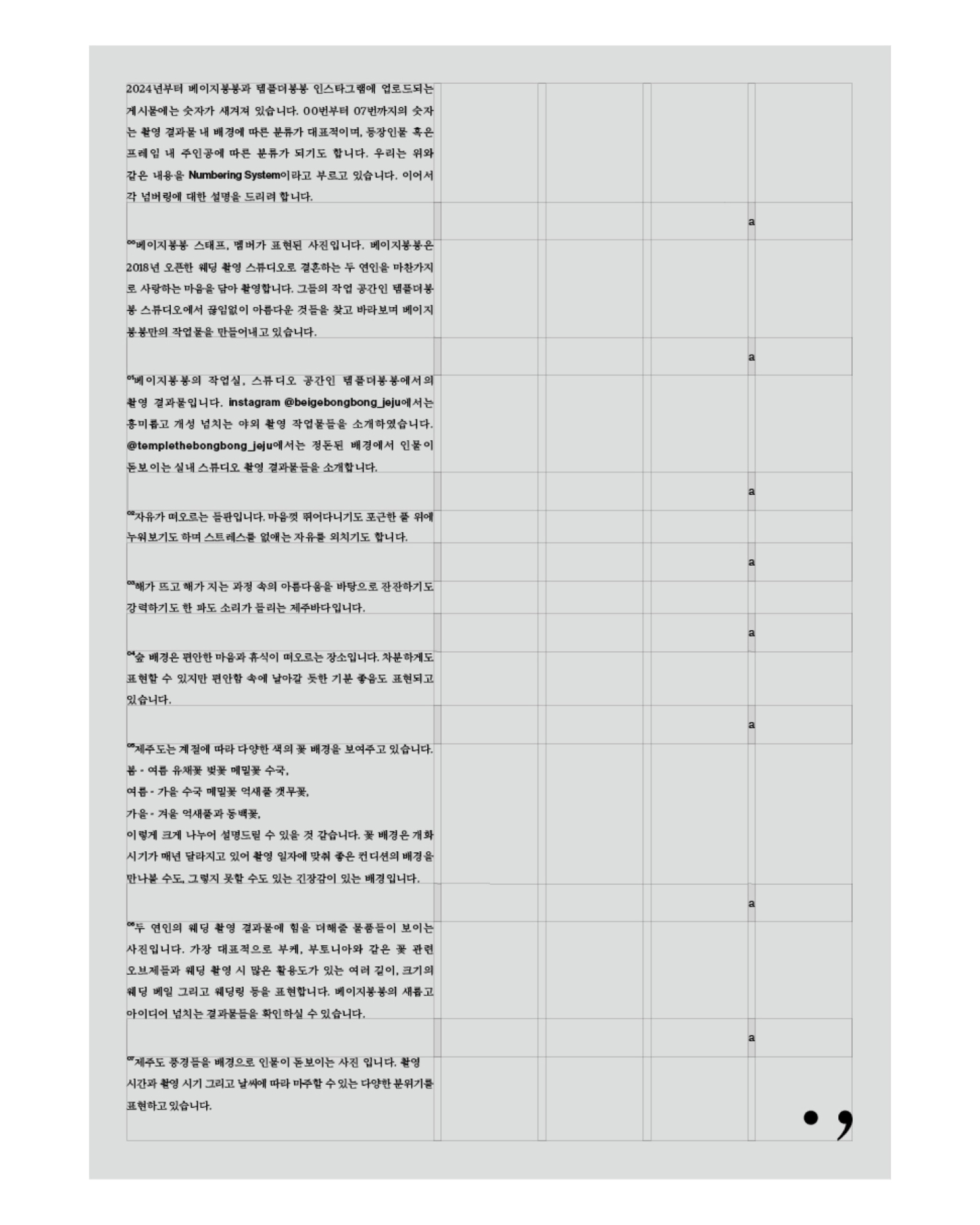


Project Name : Beigebongbong
Task Scope : Identity design
Category : Commercial
Completion : Dec. 2023
Before establishing the exact design concept, I conducted research into the characteristics of 'Beigebongbong' (and 'TTB Studio') and the customers who seek out this brand.
Brand features: 1. Mainly capturing wedding photos. 2. Located in Jeju.
From the customers' perspective: 1. A desire to boast and be envied. 2. A once-in-a-lifetime shoot in life, leaving no room for revisions or reshoots. 3. Expectations for outdoor shoots. 4. Paying higher fees compared to other wedding studios.
Based on this research, I set the direction for rebranding. Since it's a once-in-a-lifetime event, I believed it needed a structure highlighting the subjects—i.e., the customers—the most on the shooting day and in the outcomes. Therefore, keeping studio logos or design elements minimal and ensuring the visitors' appearances stand out the most became the baseline standard.
Next, there were pros and cons associated with the location: [Jeju]. Abundant outdoor shoot options presented the advantage of relative freedom from typical wedding-shoot attire norms. However, due to its location, there were non-shoot expenses like transportation (vehicles, flights) and accommodation that acted as disadvantages. Thus, I believed providing value for consumption—i.e., offering a multi-dimensional brand experience—was essential.
By verbalizing prior research, I established the brand features: 1. Restrained neatness (A commercial-shoot base, yet not emphasizing it). 2. Classic aesthetic (Work delivered to customers bears a permanent nature, unlike ephemeral ID photos/sticker booths). 3. An inconvenience to willingly endure (If studio location/costs are unchangeable, aiming to provide a systematically elaborate, multi-dimensional experience invoking 'Going this far?' surprise).
Thereafter, based on the verbalized brand characteristics, I established practical visual features to apply to the design: 1. Concise 2. Permanent 3. Completed by hand.
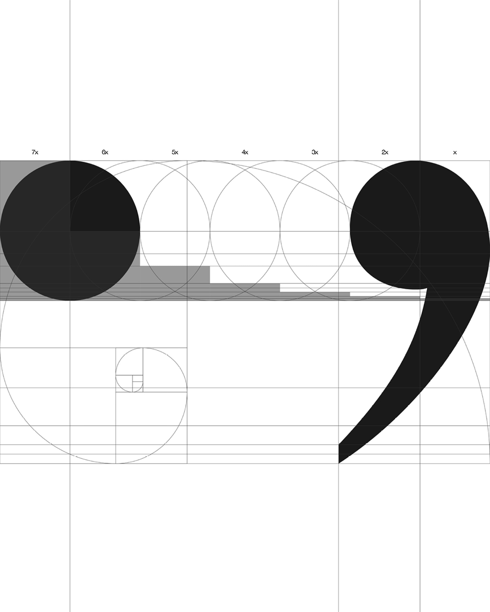
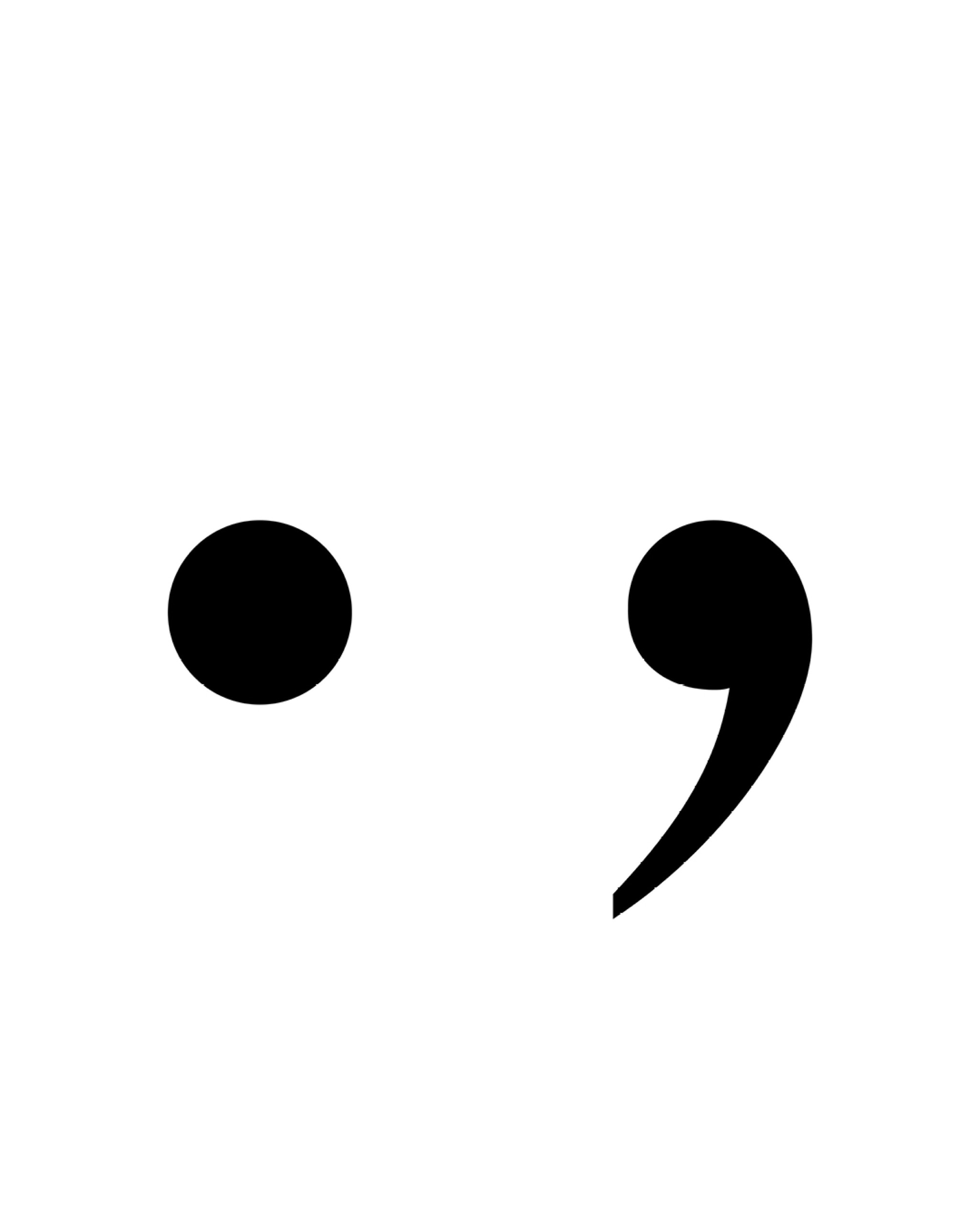
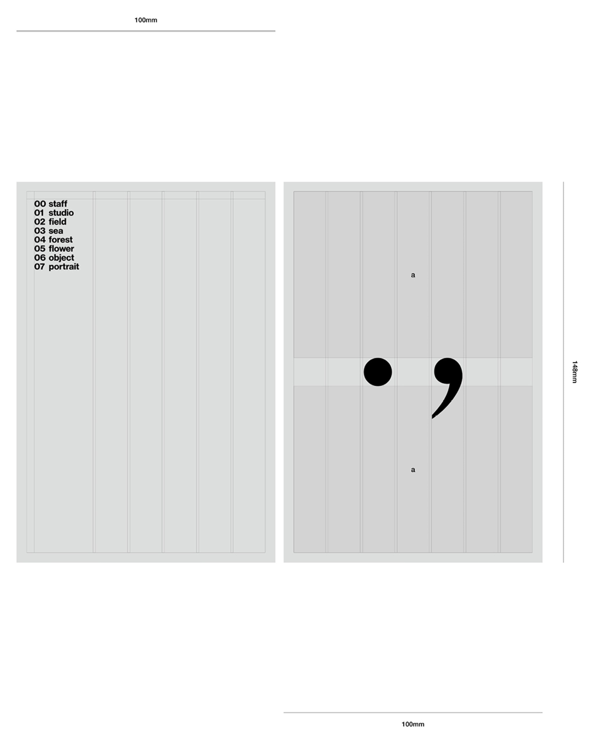
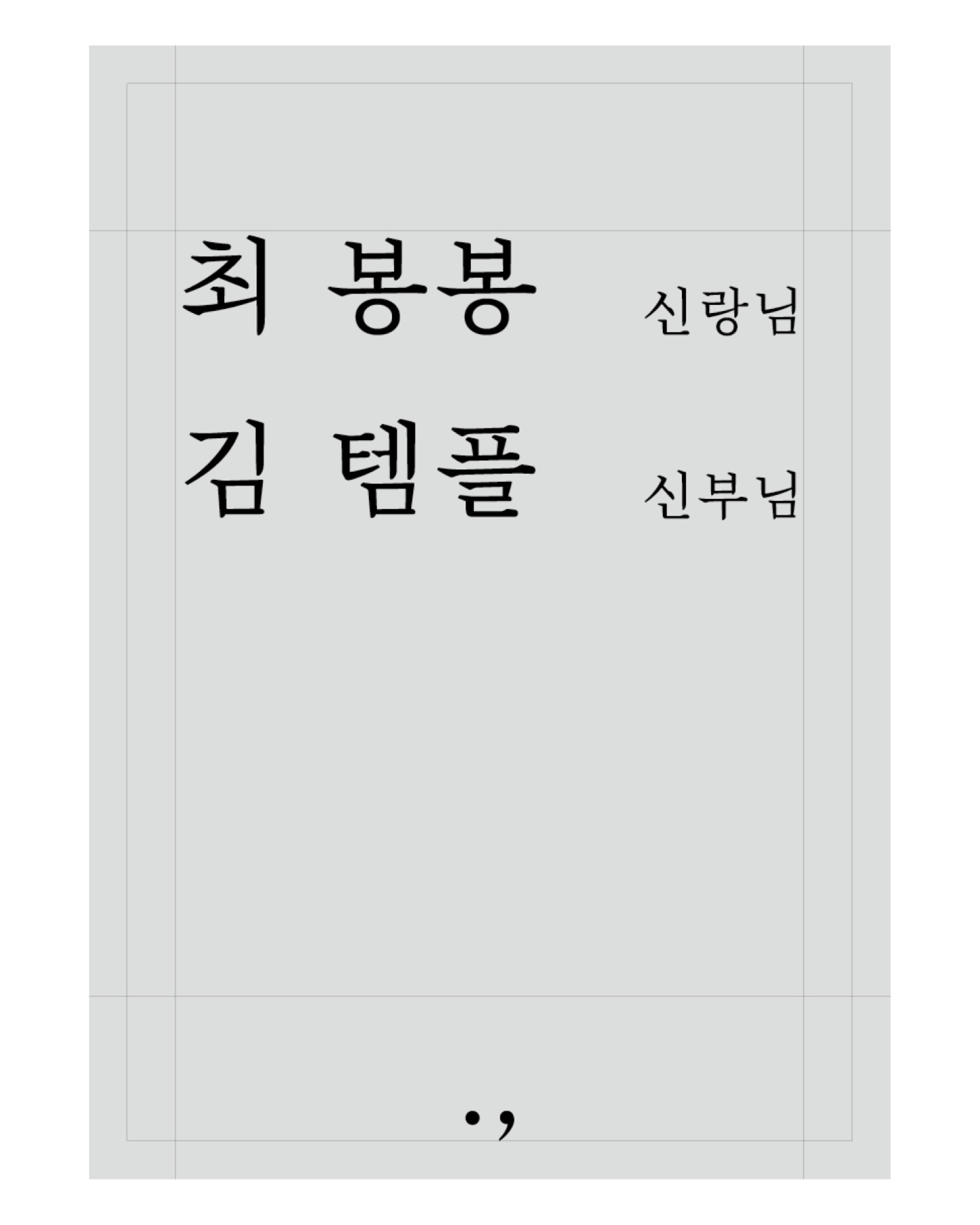
Based on these visual features, I designed 3 types of logos. Adopting a design that leverages punctuation marks based on the wedding characteristic—[The end, while simultaneously a new beginning]. Specifically, I utilized periods (.) and commas (,). The period (.), found at the end of sentences, intuitively suggests atmospheres like finality or endings. By definition, it's used to indicate days holding specific meanings in Arabic numbers. Distinct from the period, the comma (,) incites imagination of continuity and progress rather than ends. Using two contrasting punctuation marks, the design was constructed adjusting to a ratio (1:1.618) to avoid hindering fundamental aesthetic balance and the system while retaining simplicity.
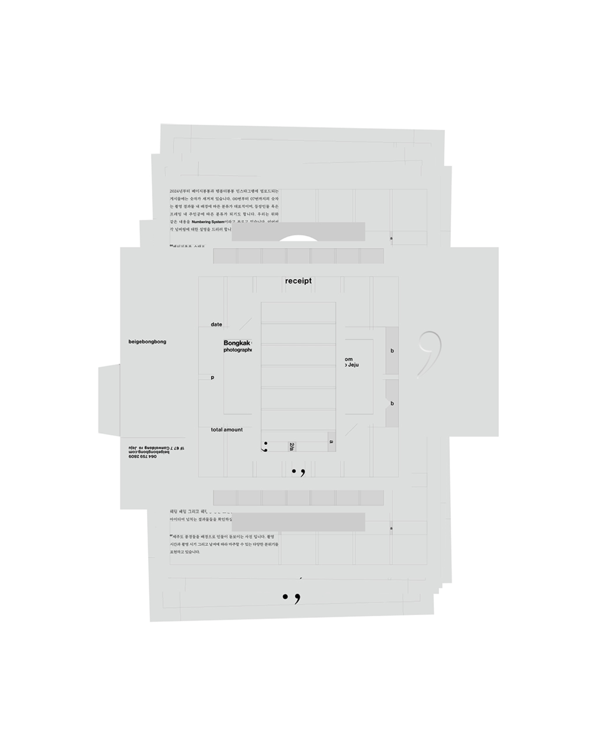
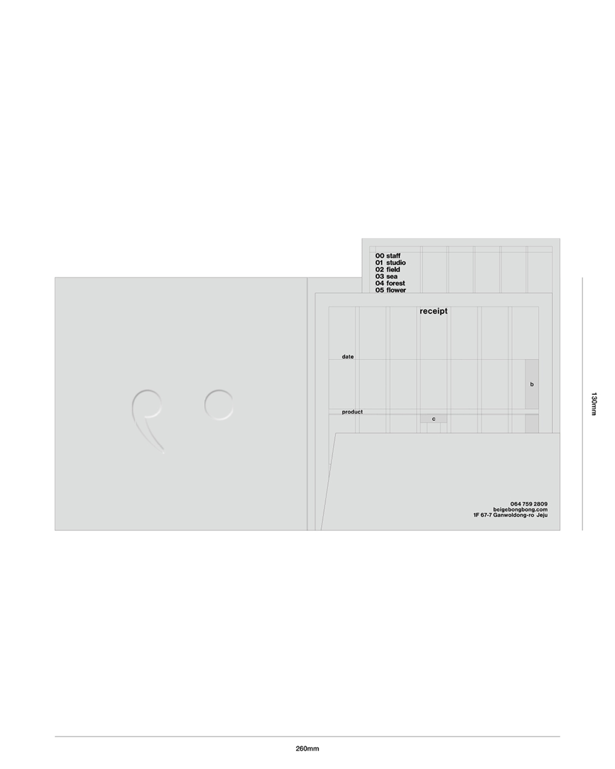
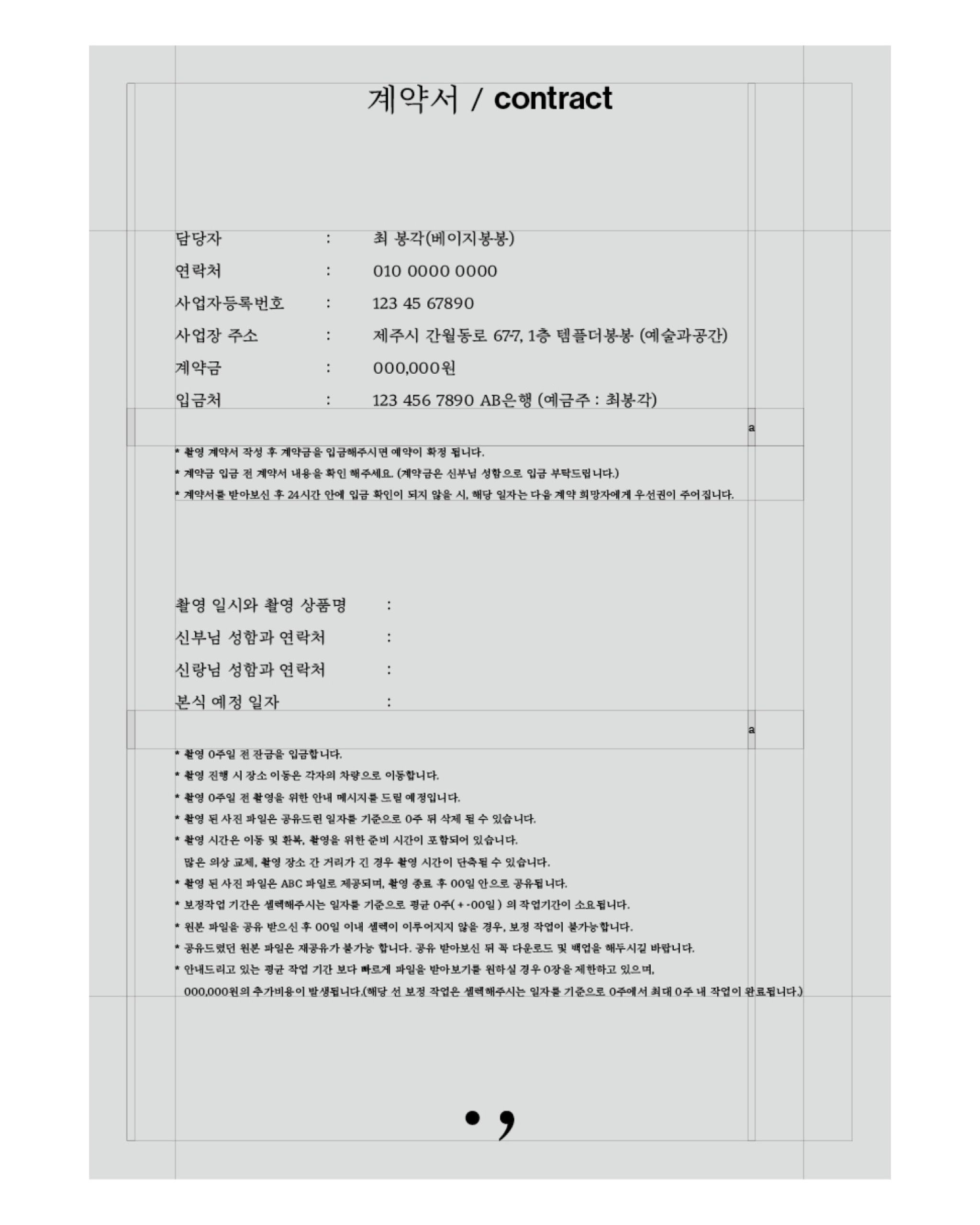
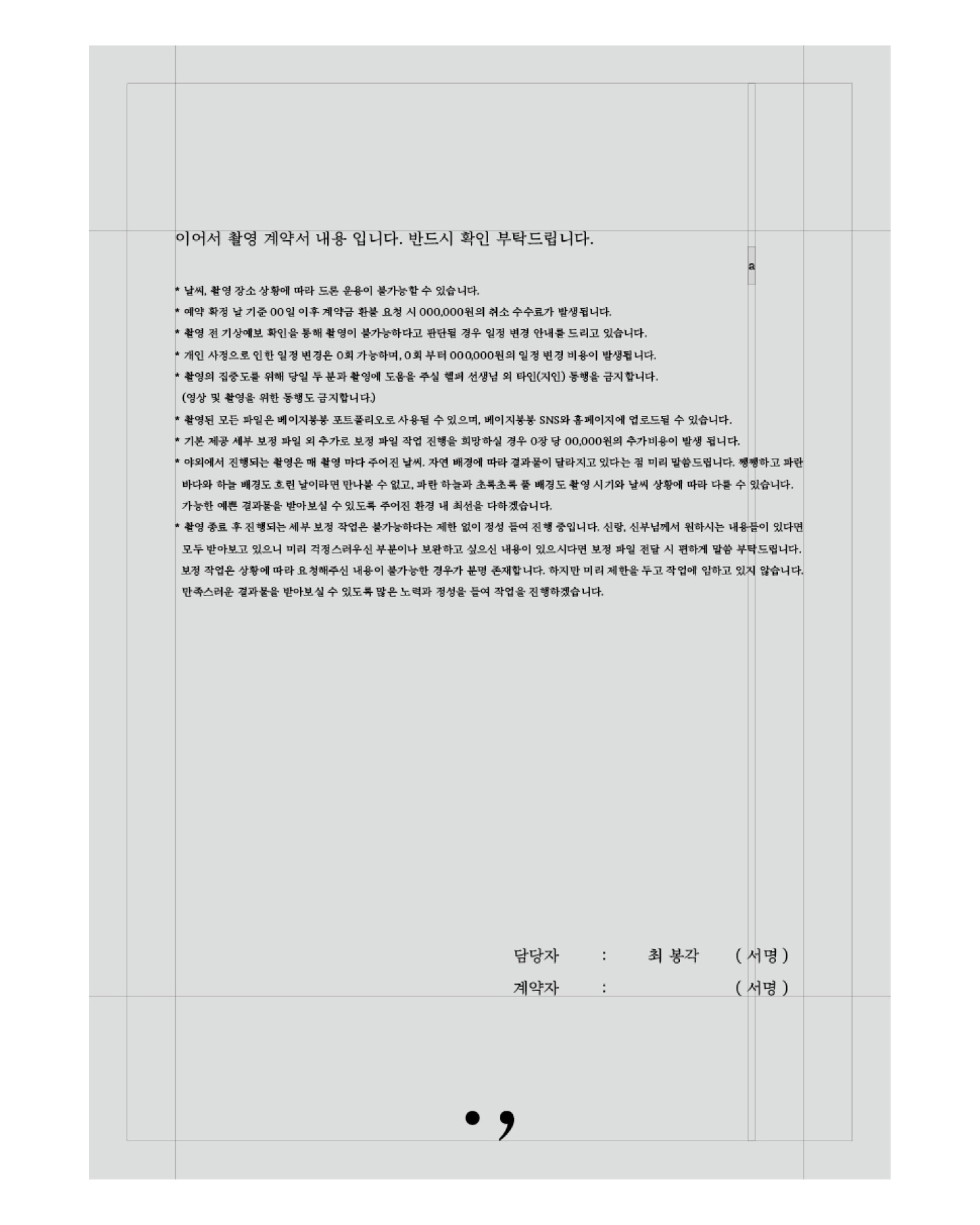
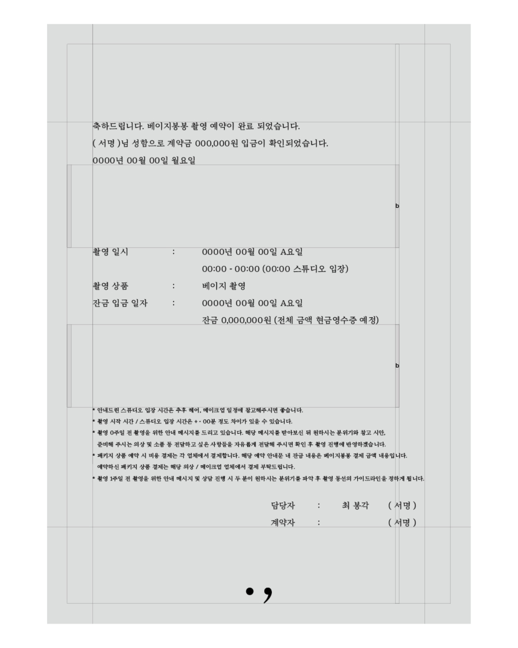
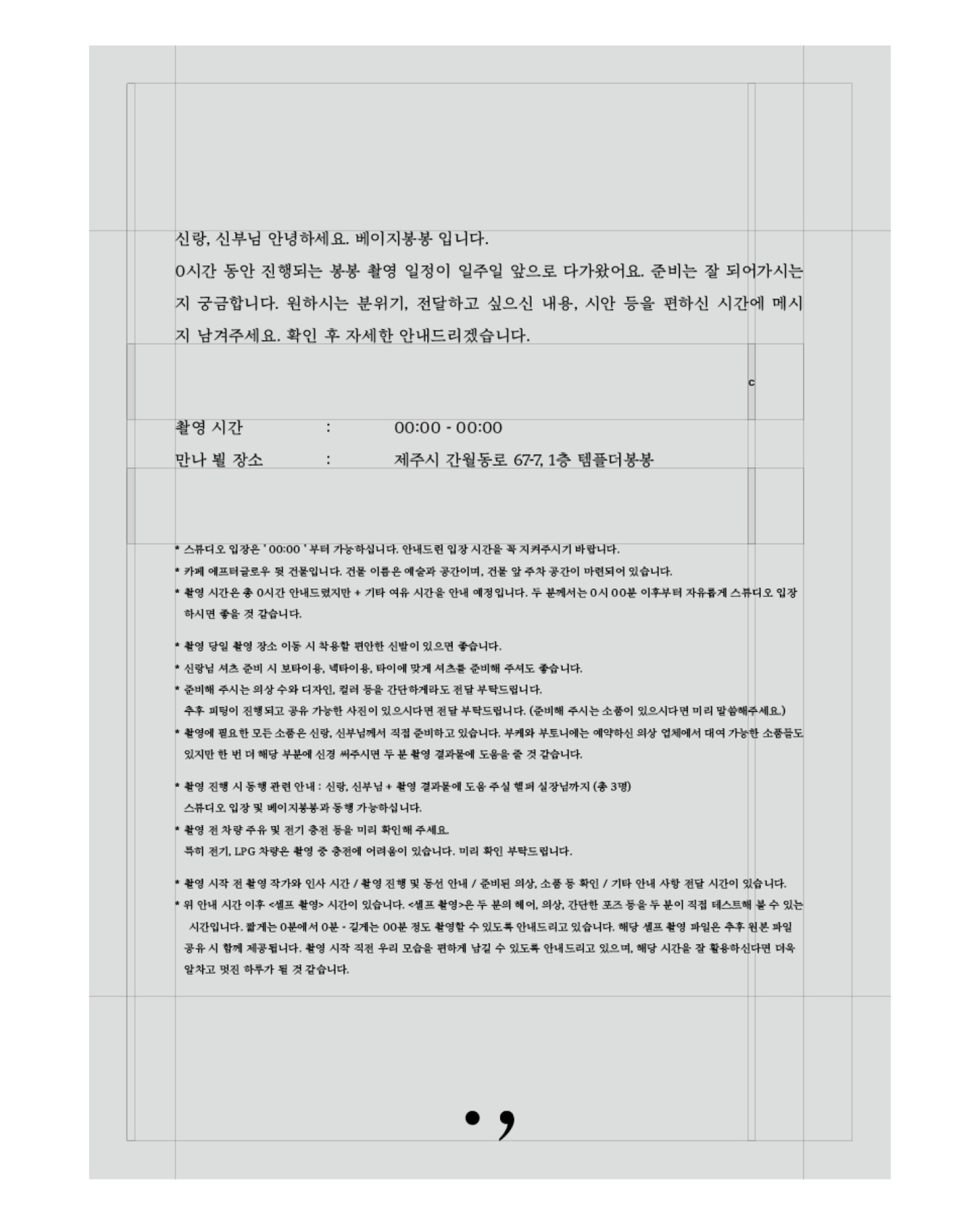
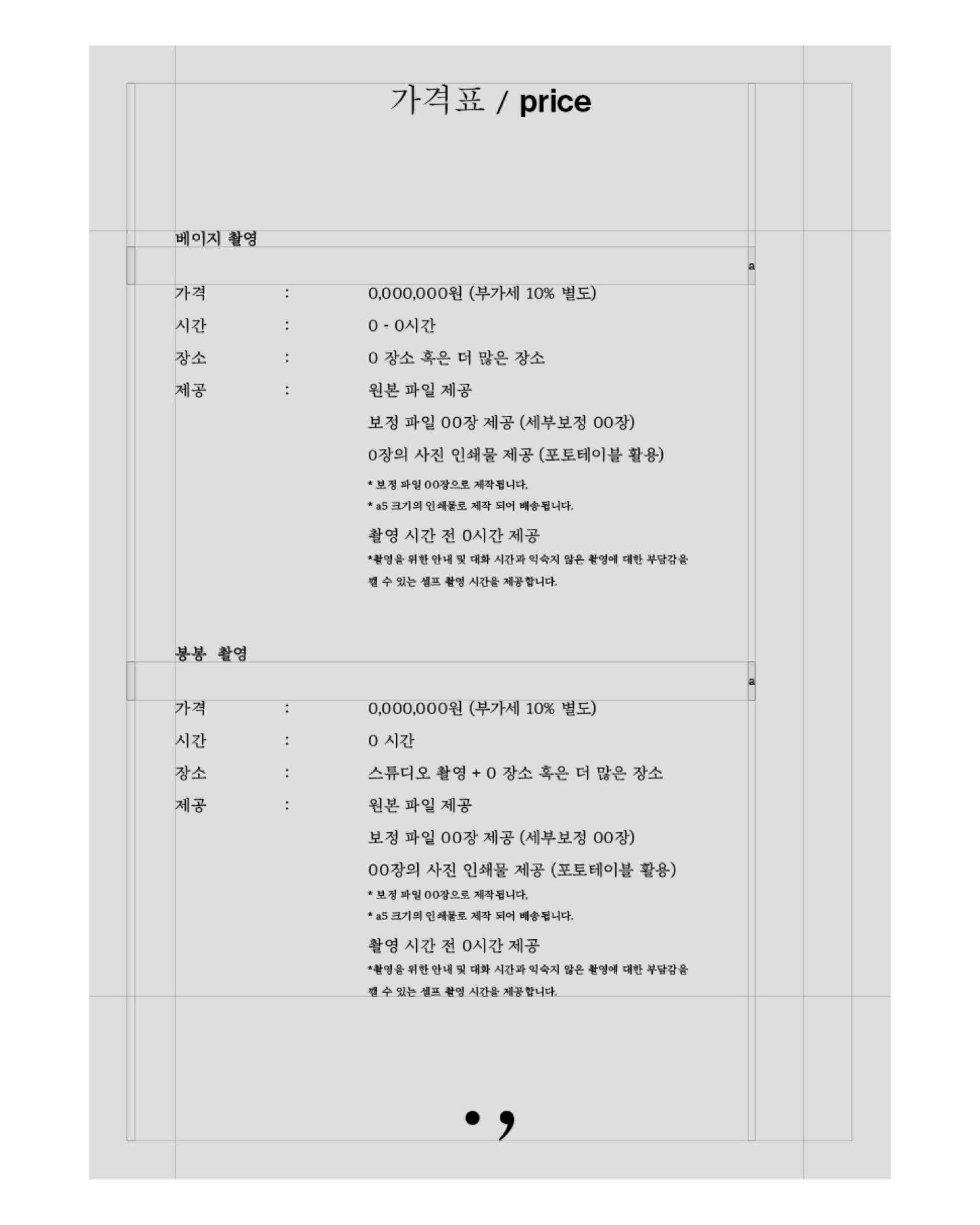
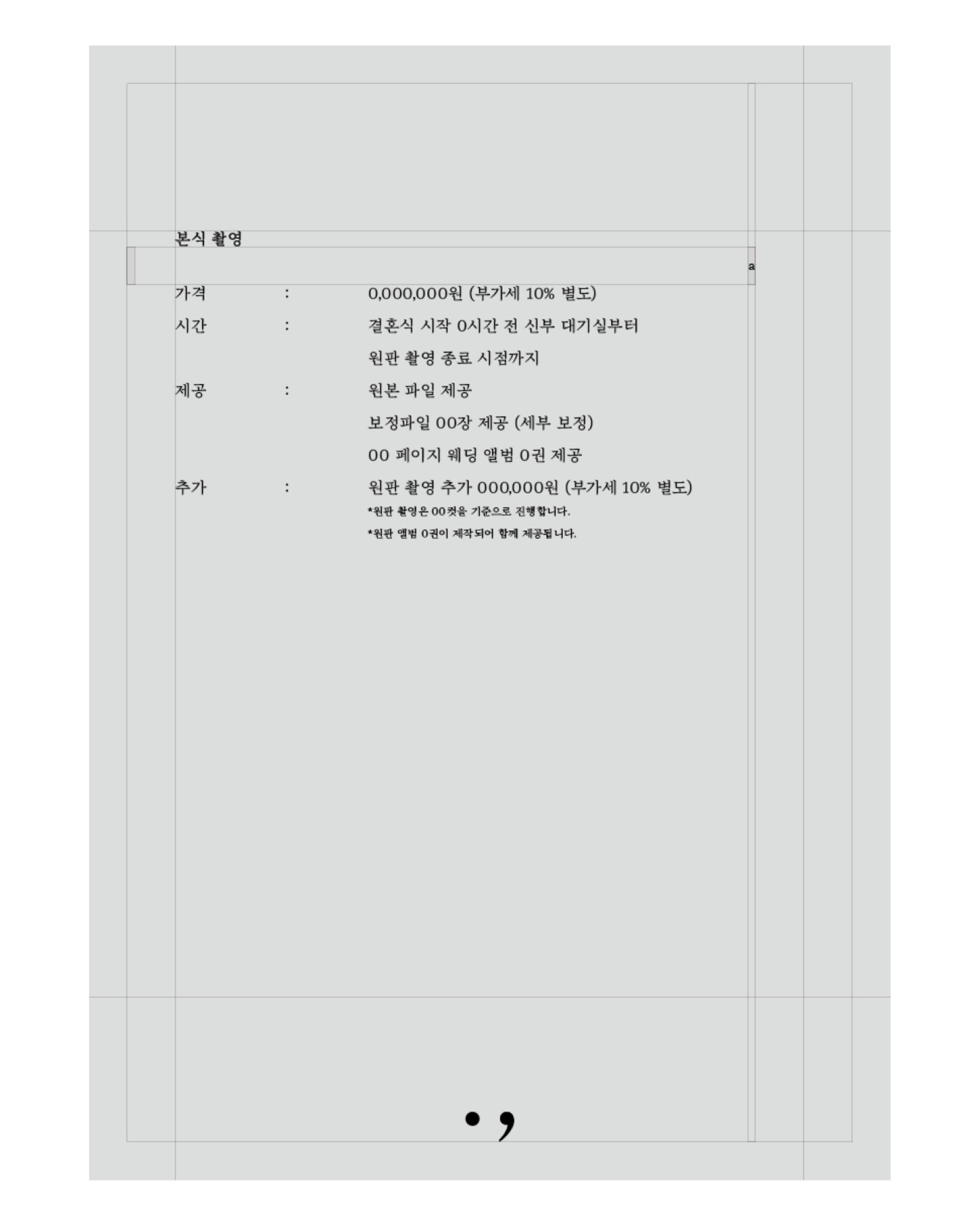
For applications, I categorized tasks into: Before customer visits, On the day of visit, and Post-visit. Converting contracts/guidance messages previously exchanged via phones/messengers to paper formatting, I introduced procedures reviewing contracts/necessary guidance before visits via [Price List], [Contract], [Contract Confirmation], and [Week-Prior Guide], designing them on paper stock.
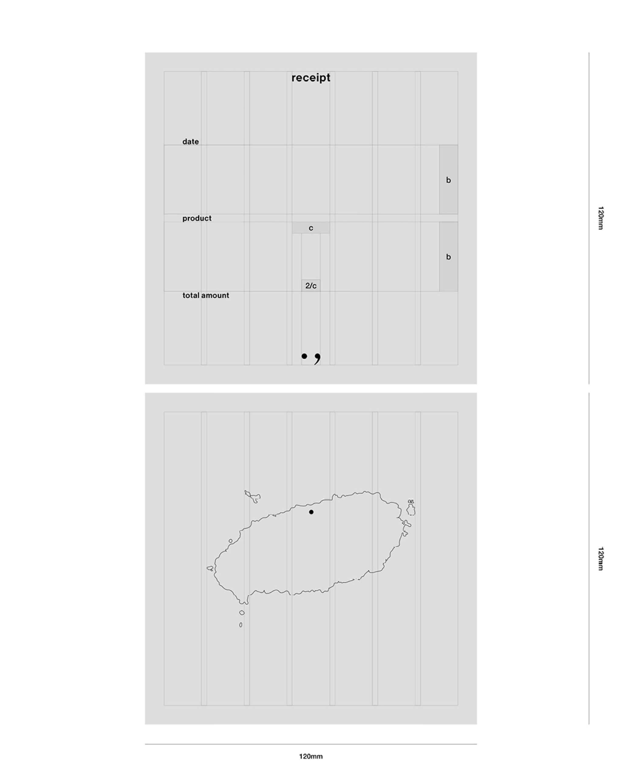
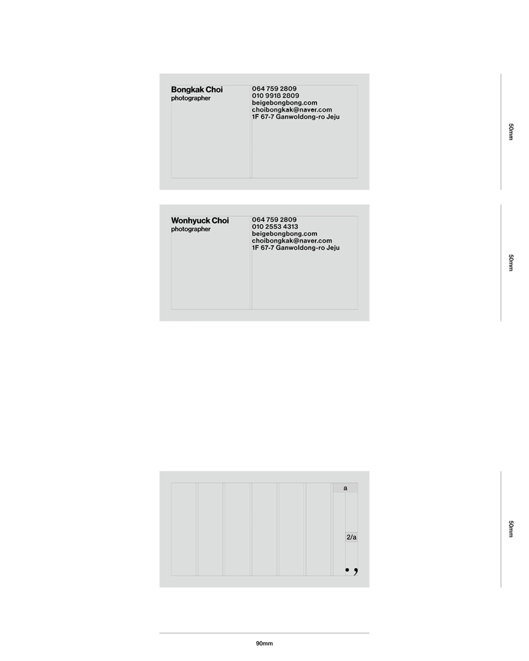
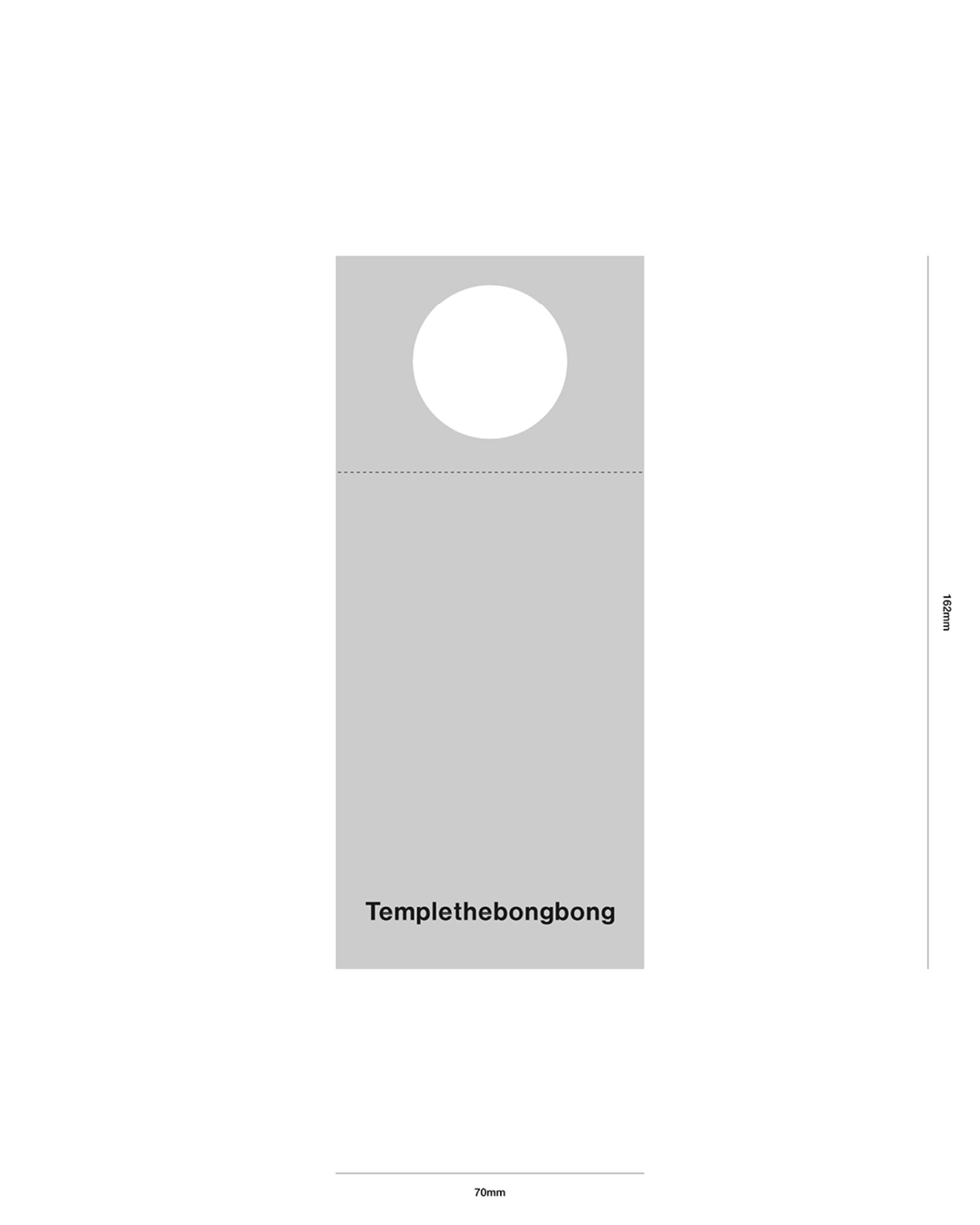
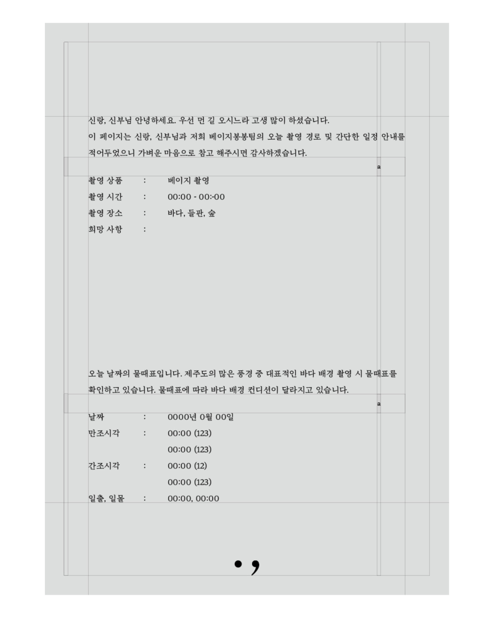
For the visit day, I designed applications that could offer tangible experiences directly inside the studio: [Shoot location info/process sheet], [Sign-stand], [Receipt], [Receipt holder], [Cup sleeve], [Business Card], and [Guide regarding studio introduction and shoot system]. Lastly, post-visit, I designed the layout for [Postcards] and [Other paper supplies] based on the shot images, finishing up by finalizing the packaging.