
Sound : On / Off
Project Name : Fitness ideal x Bongkak Choi
Task Scope : Identity design
Category : Commercial
Completion : Aug. 2024
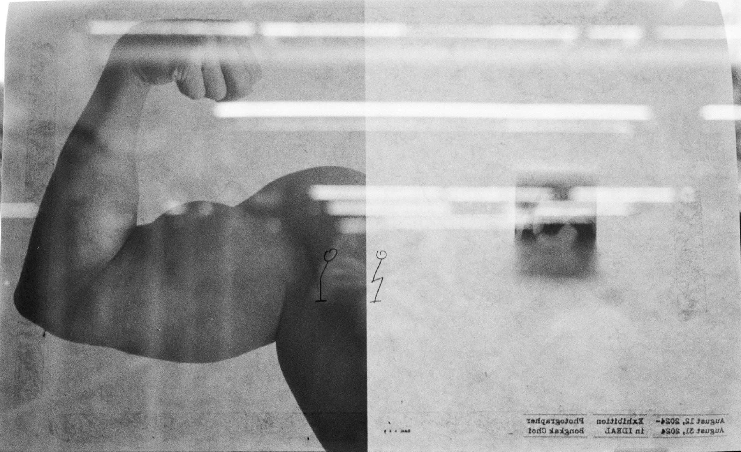
During the stage of defining the project's visual concept, I went through a process of defining directionality with the phrase [An Invitation-like letter: Considering the power of photography on a limited page]. Because the main medium of the exhibition was photography, the photo had to be emphasized the most even on the main promotional poster, alongside the challenge that the exhibition poster must act as an invitation like a letter.
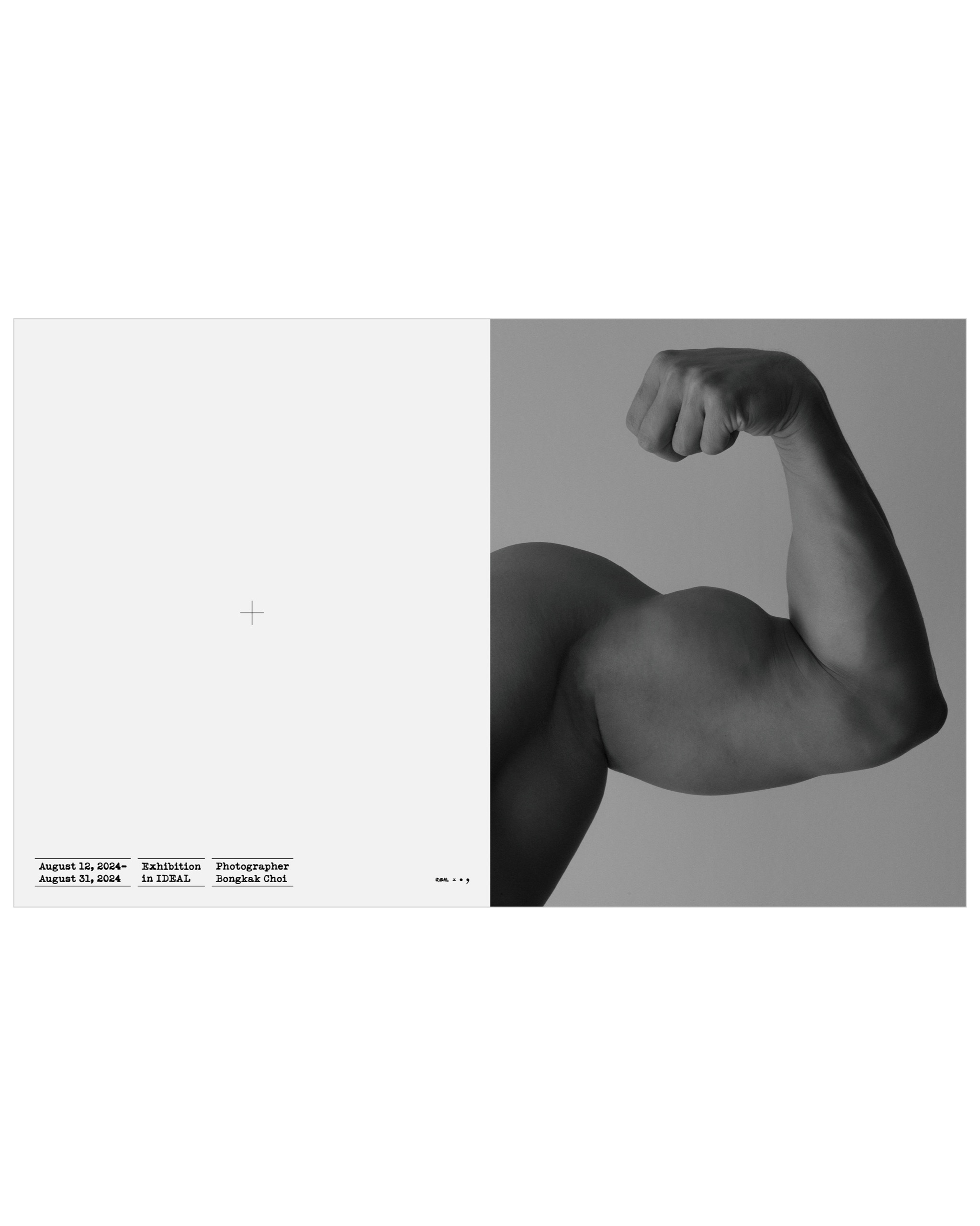
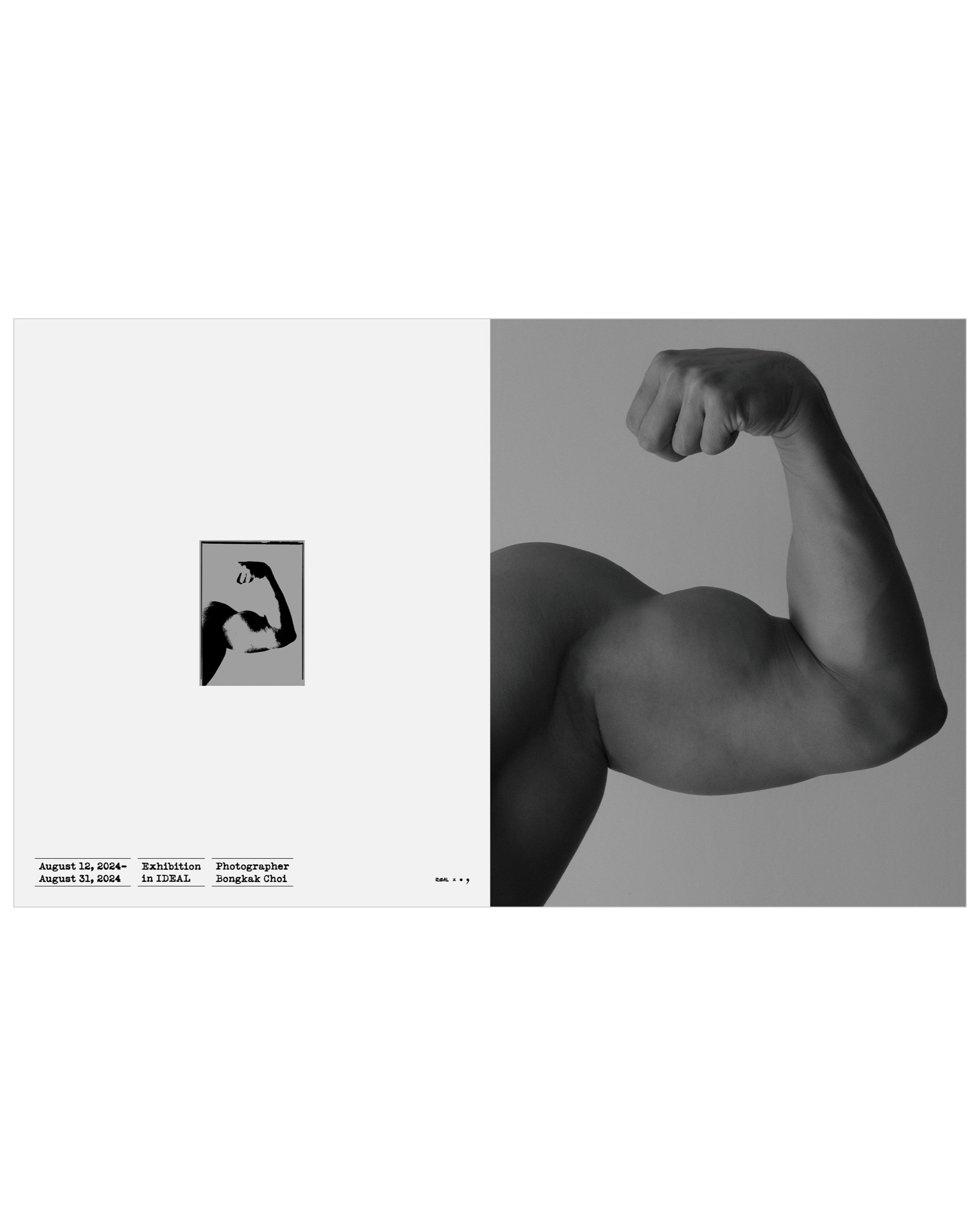
To solve the tasks, I first deliberated on solutions for texts containing exhibition information, layouts, etc. With the common vertical formats (A2, A3), there were two approaches: 1. Reducing the size of the photo within the page to express it so that other info doesn't intrude on the photo. 2. Using the photo at the same size as the page, expressing the power of the photo through its scale.
In the case of [1], it had the advantage of granting pure photographic territory as other info doesn't intrude, but because it reduces the size itself, there was a question of whether it possessed an intuitively felt power within the page. In the case of [2], by using the photo at page size, the problem of [1] could be solved. However, as other info was placed over the photo, an issue arose where the poster didn't have smooth layers but rather clearly divided strata (1st floor photo, 2nd floor info), creating a heterogeneous atmosphere. Ultimately, judging that the problem couldn't be solved with a vertical format, I finally adopted using the page itself in a horizontal format.
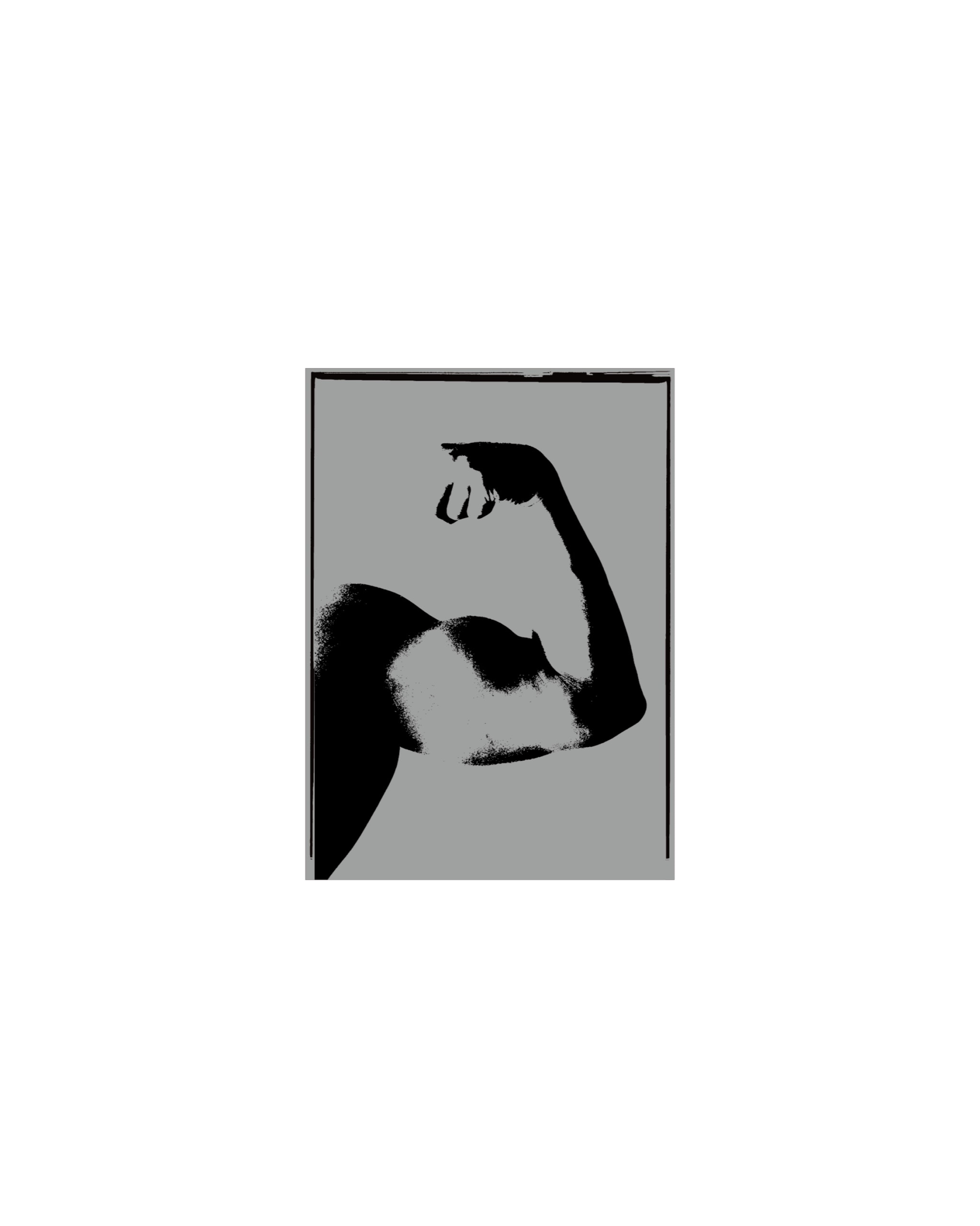
Specifically, assigning half the area to the photo and half to information, I designed an <envelope> style layout placing exhibition info at the bottom on the left, and based on the idea of attaching a stamp when sending a letter, I designed a photo-based [Stamp] in the center. The right side was dedicated entirely to pure photography to intentionally increase visibility.