
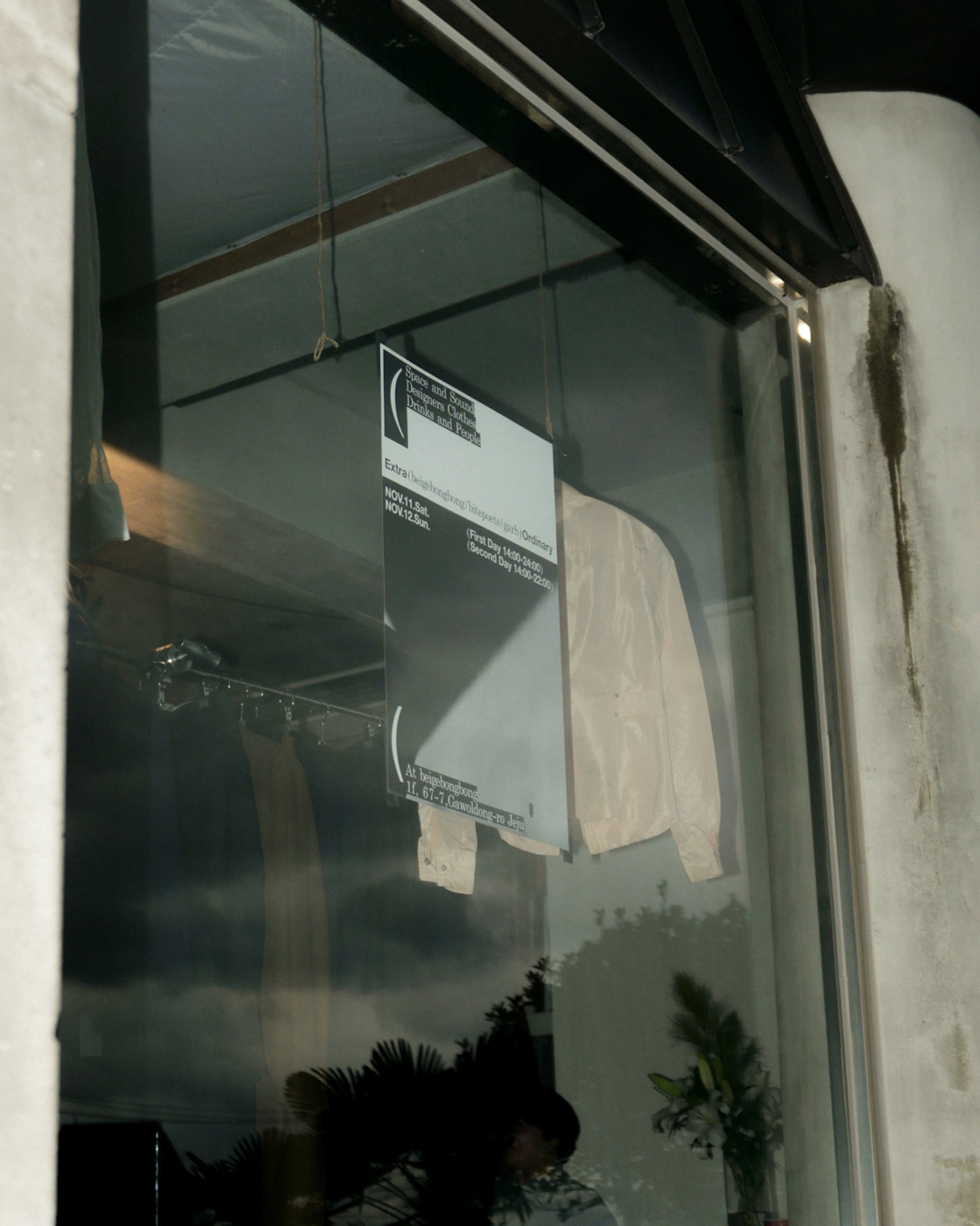
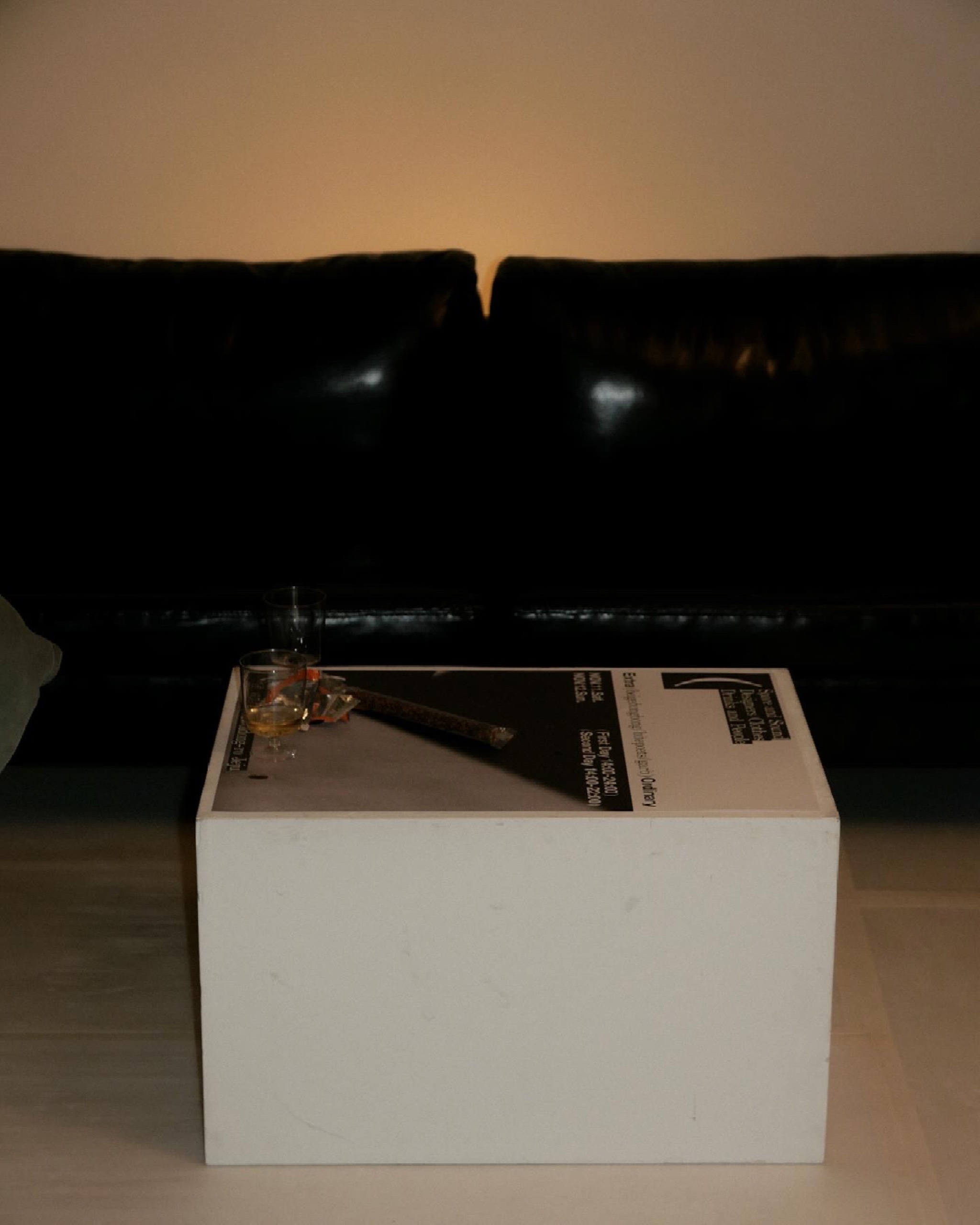


Project Name : TTB x Bite Poets x Garb
Task Scope : Identity design
Category : Commercial
Completion : Nov. 2023
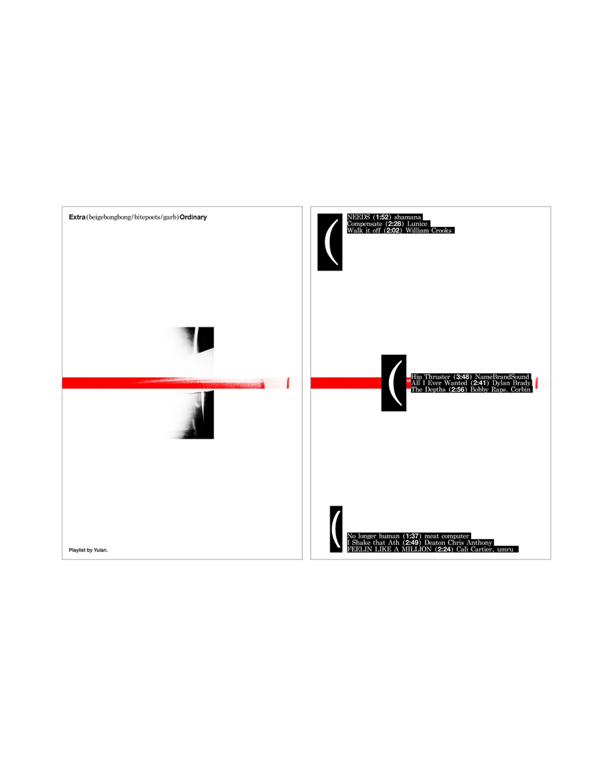
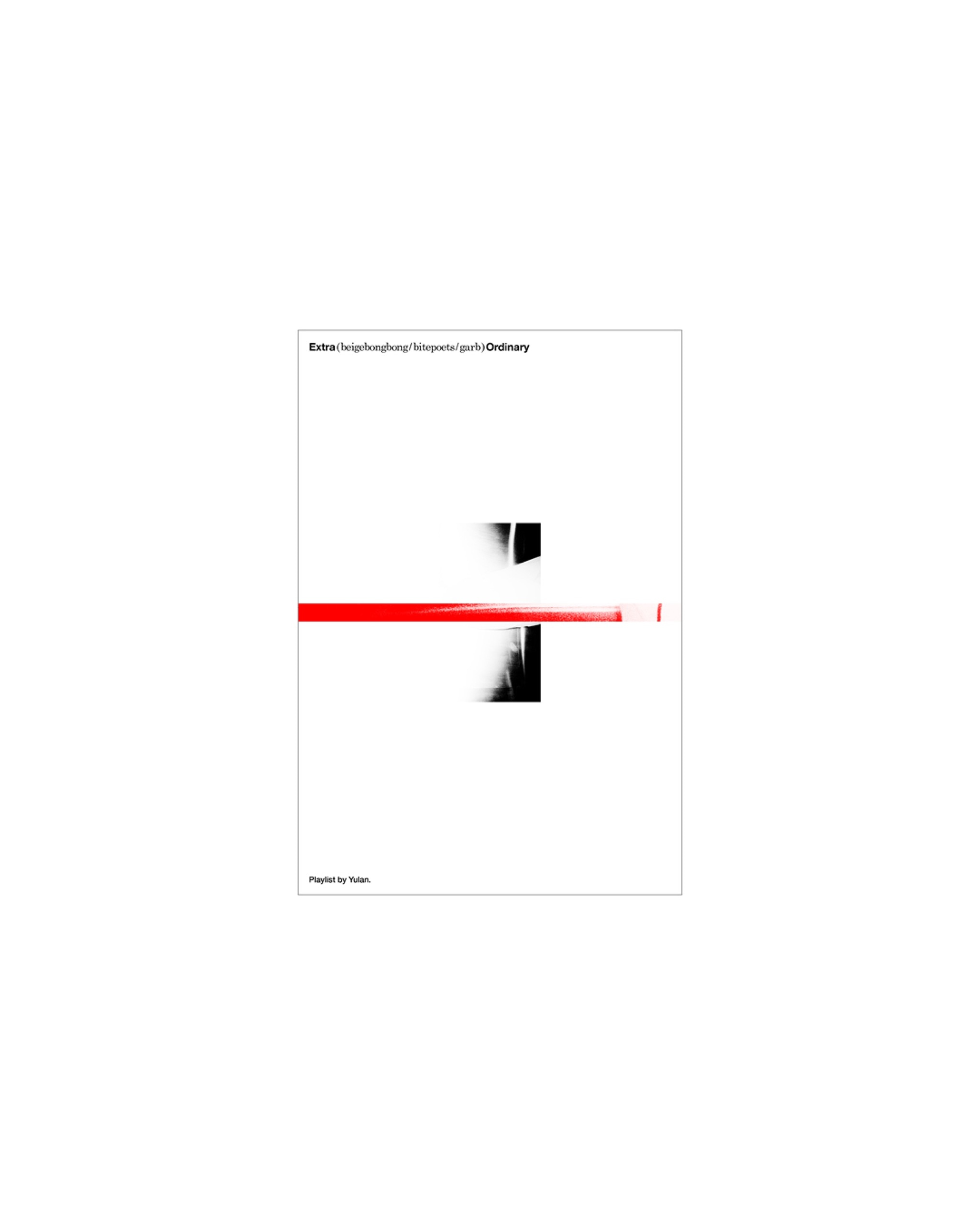
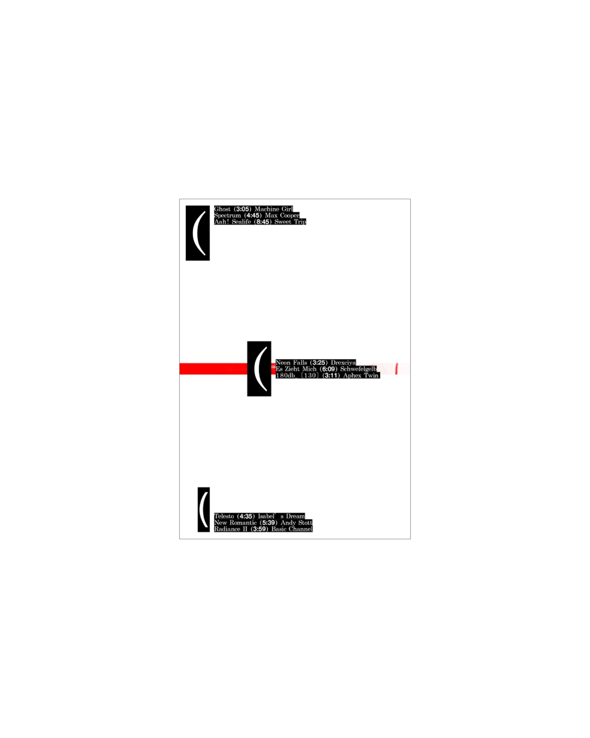
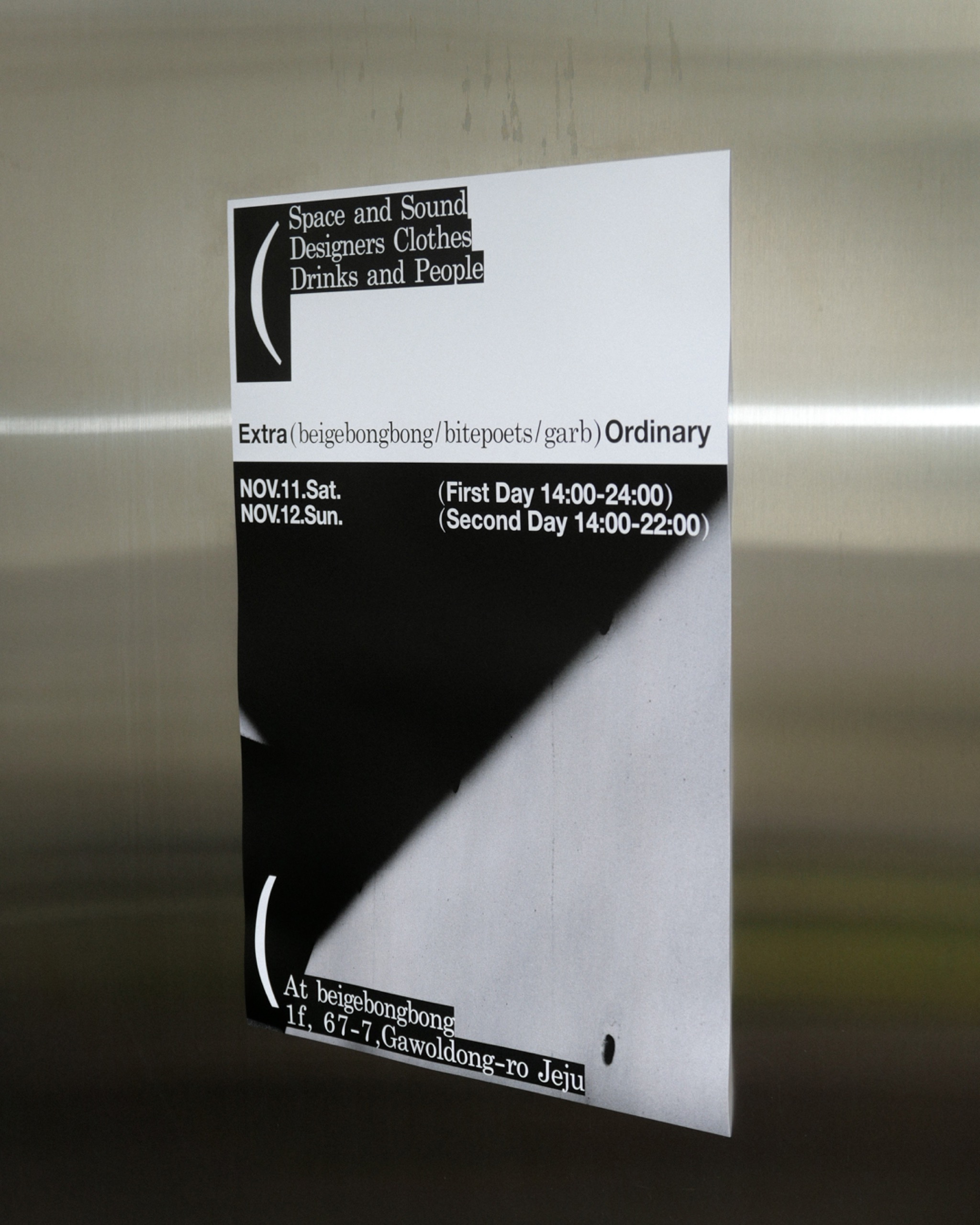
I was in charge of the offline event graphics for three brands: a photo studio and wine bar located in Jeju, and a select shop located in Seoul. In the stage of defining the project's visual concept, I thought a visual language tying the three distinct brands together was necessary. Based on this thought, I considered two approaches: 1. Symbolization 2. Formalization.
Ultimately, I adopted method [1], expressing the main image through the punctuation mark of parentheses ( ). Given that the main purpose of visualization was [Conveying news of the offline event involving three brands together], I believed [1] was effective as a means to intuitively convey the main purpose. Specifically, for [2], it would require two steps: making an image tying the three brands and granting meaning to it. On the other hand, for [1], I judged the meaning of [Being included] was already inherently bestowed through the symbol. Thus, since the intended meaning was already present in [1], I thought it was an advantageous approach for both the expression method and the viewers.