Sound : On / Off
Project Name : Seong Yoon-seon's Janggu Dance Network ≪Companion≫ Ⅱ
Task Scope : Identity Design
Category : Commercial
Completion : Jun. 2025
Following ≪Companion≫ in November 2023, I was in charge of designing the second ≪Companion≫ project in June 2025.
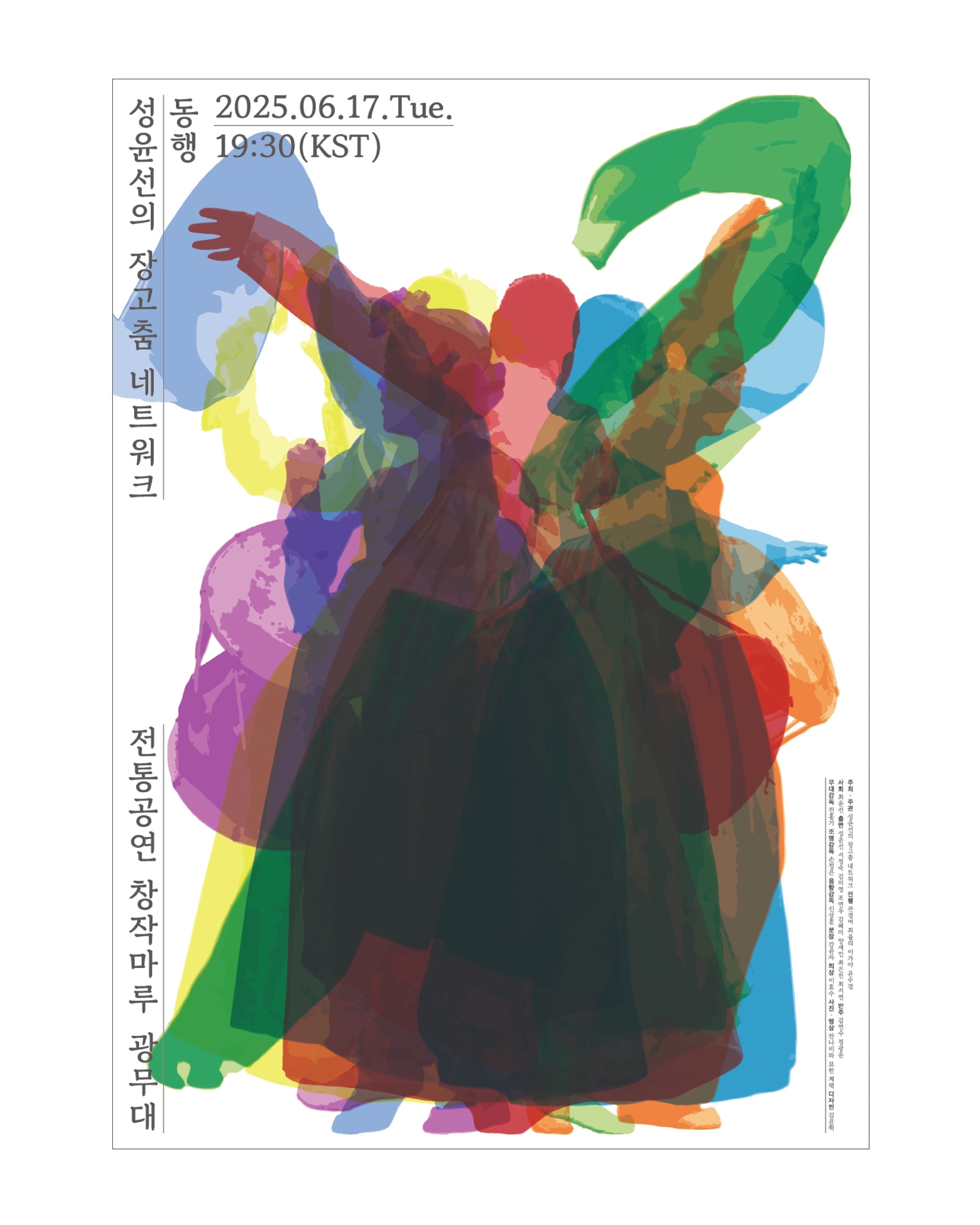
This performance was based on the premise of conveying the message, <Even if alone, we are moving forward together>. Since the structure presented seven pieces within a single performance, I had to deliver the message that the dancers of the seven pieces were moving forward together within a limited space. Also, as the title suggests, I had to consider that the atmosphere of the performance was warm and familial.
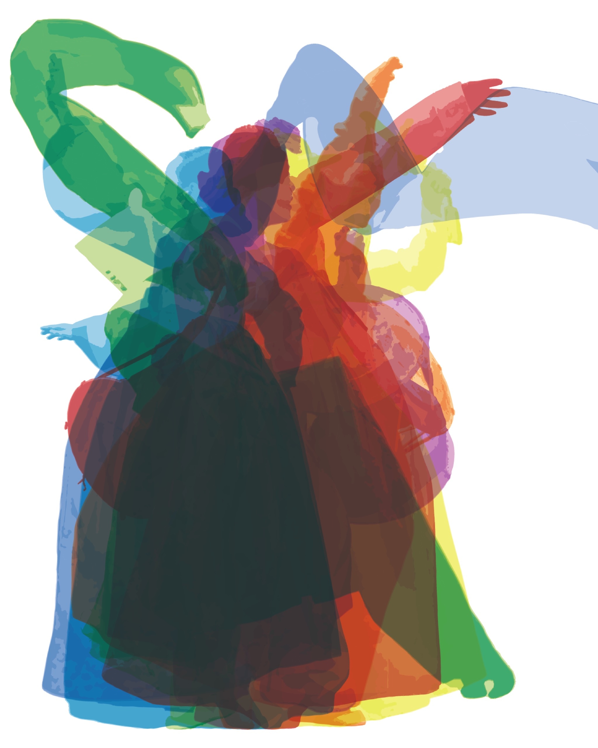
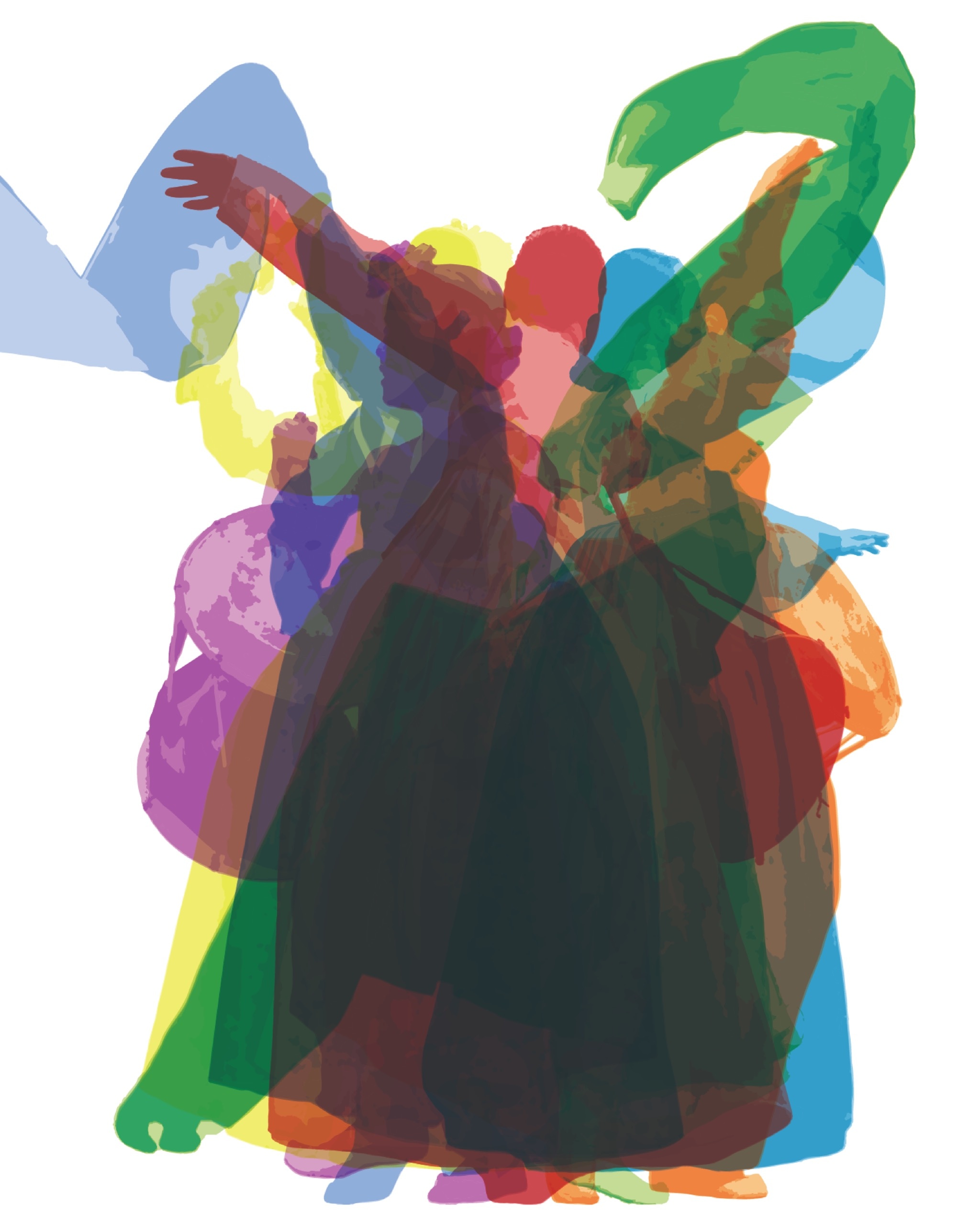
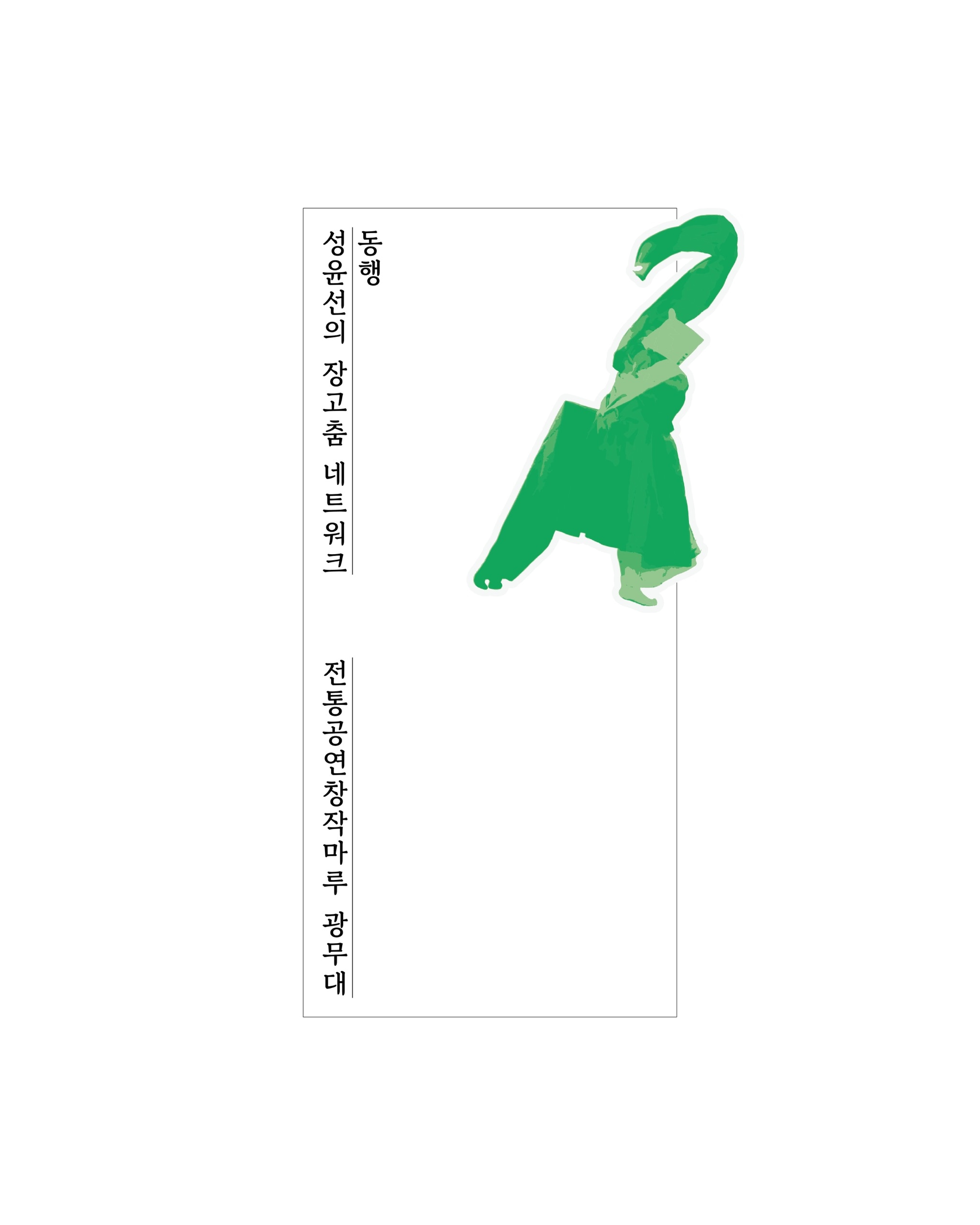
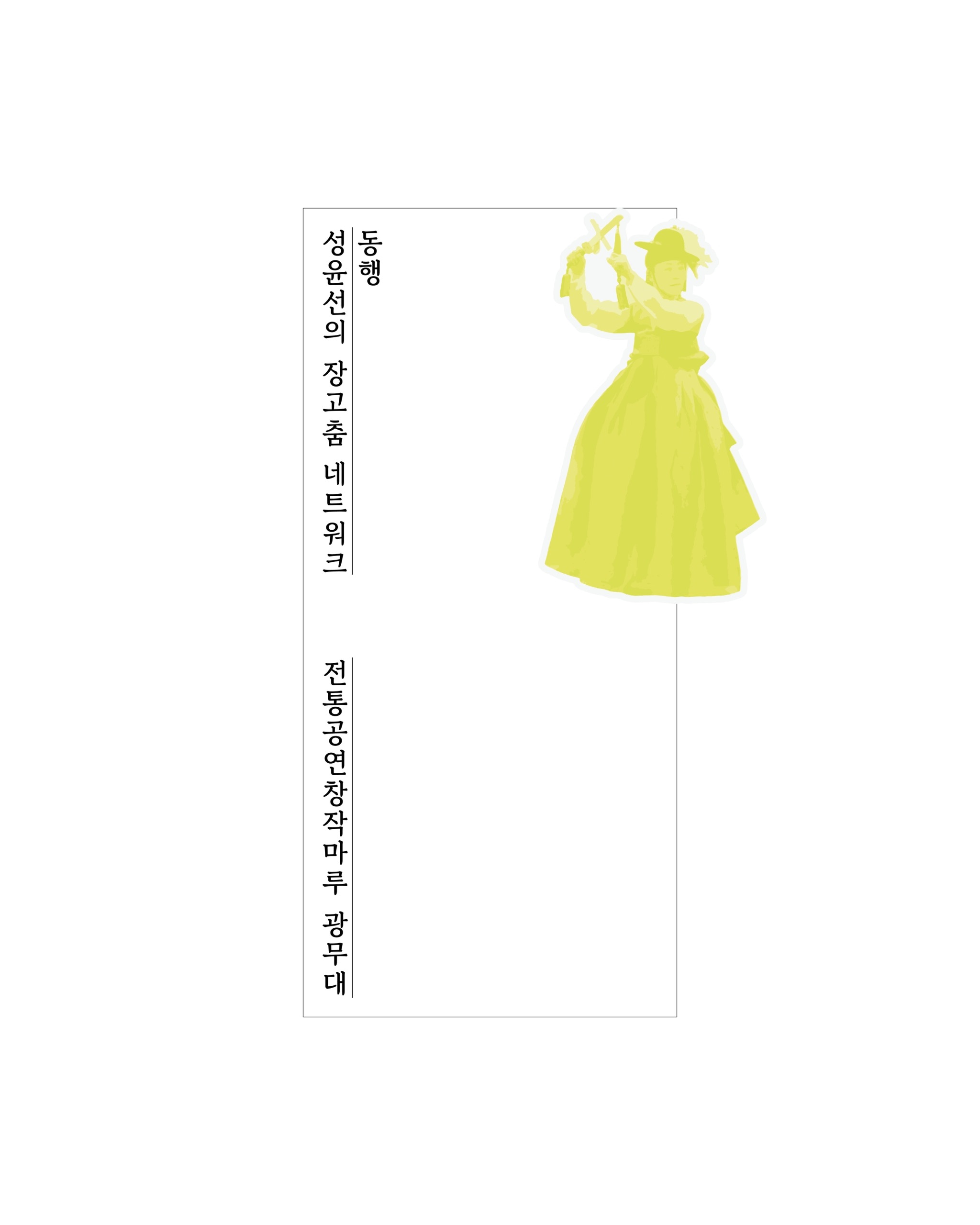
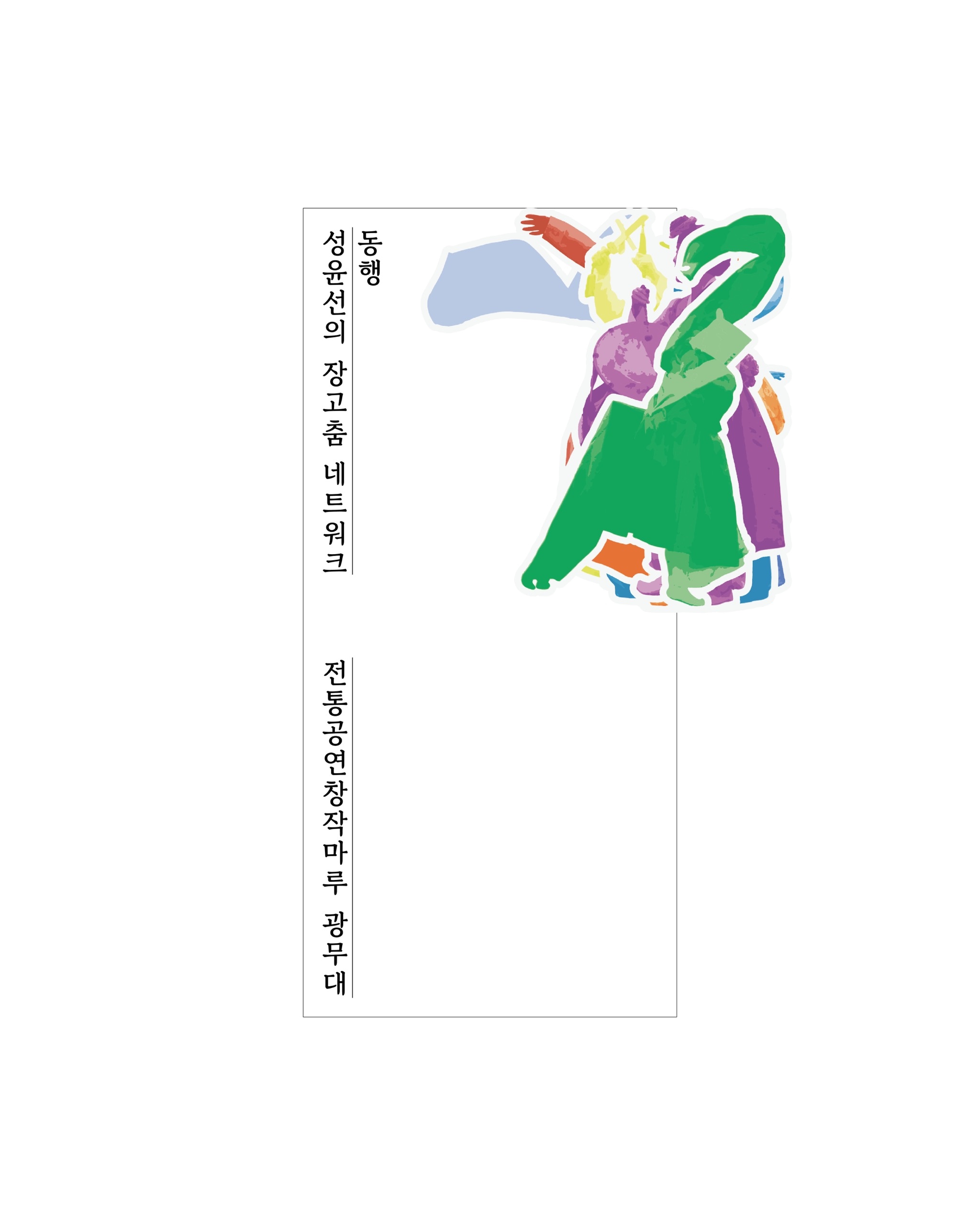
To visually express <alone yet together>, I needed to express both <alone = separation> and <together = fusion>. For this, understanding the true meaning of <alone>, capturing the main characteristics of the 7 pieces, was necessary. Therefore, with permission, I conducted a photo shoot for each piece during the first demonstration. Through preliminary research and demonstrations, I received the impression that the components taken in the pieces (costumes, instruments, main movements) were different. Utilizing this, I tried to express <alone = separation> by emphasizing the differences between the main images representing each piece.
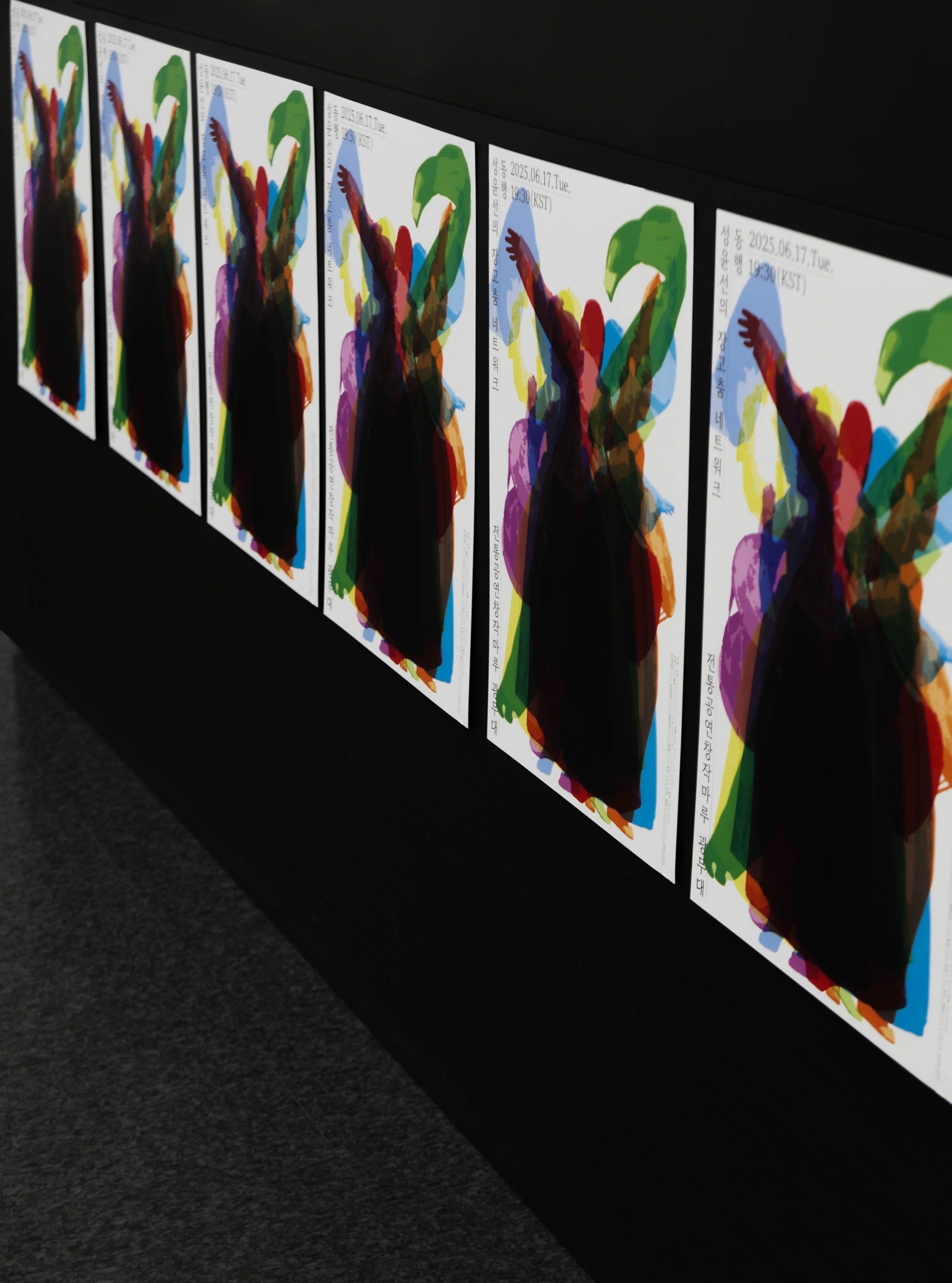
As a method to express <together = fusion>, I adopted a method of sharing the same baseline against a horizontal line. Considering the meaning of <Companion (Donghaeng)>, it can be interpreted as <walking together> or <moving forward together>. When people walk a path together, the line their feet touch becomes identical, so I judged that the message of <together> would be clearly conveyed if the bottom edges of the 7 pieces touched the same line. However, if constructed this way, due to the size of the page, the main scenes of each piece would inevitably have to take either a horizontal (ㅡ) or vertical (ㅣ) form. In the case of horizontal, since seven pieces have to fit horizontally, the size of the main scene is forced to become smaller. In a vertical format, the size of the scenes can be maintained, but there's an issue where the main scenes of the pieces clump in one place, failing to maintain their shape. More specifically, the horizontal format gives the impression of emphasizing <alone> rather than <together> when listed, due to the number of pieces. The vertical format has overlapping surfaces as a drawback, but simultaneously intuitively delivers the message of <together>. Thus, I chose the vertical format, thinking I only needed to solve the problem of shapes not being maintained due to overlapping surfaces.
I thought the issue of shape maintenance could be easily solved by emphasizing the individuality of the main images of each piece, which were structured centrally around their differences. Since the main scenes were selected, the shapes were already different, and I thought I just needed to pinpoint the differences with something other than shape. As a solution, I tried to pinpoint differences through the most intuitive color assignment. If the shapes and colors of each piece are different, one can simply think that different pieces are gathered together.
Through various contemplations and decisions, the problems I had thought of at the beginning of the work were solved, but there was one last problem remaining. Ultimately, if images of different colors are overlapped in one place, the overlapping center surface darkens during the printing process. Having chosen the vertical format, I couldn't completely solve this problem. Therefore, later on, I sub-divided the colors assigned to the main images of each piece into three stages (dark yellow, medium yellow, light yellow), adjusted the color values, and controlled the sequence of those values, striving to minimize the side effects of the overlapping surfaces as much as possible.