Project Name : Korica Logo
Task Scope : Logo Design
Category : Commercial
Completion : Jan. 2025
The Korea Research Institute of Contemporary Art (KoRICA) is an art research foundation established by Park Myung-ja, Chairperson of Hyundai Hwarang (currently Gallery Hyundai). It conducts various projects to research the art historical value of Korean modern and contemporary art and connect the context of Korean art with global art. It supports the research activities of domestic and international researchers, sponsors exhibitions and professional book publications to introduce Korean art to the global stage, operates museums on consignment, and pursues communication with global art by deploying various projects to preserve and maximize the value of Korean art.
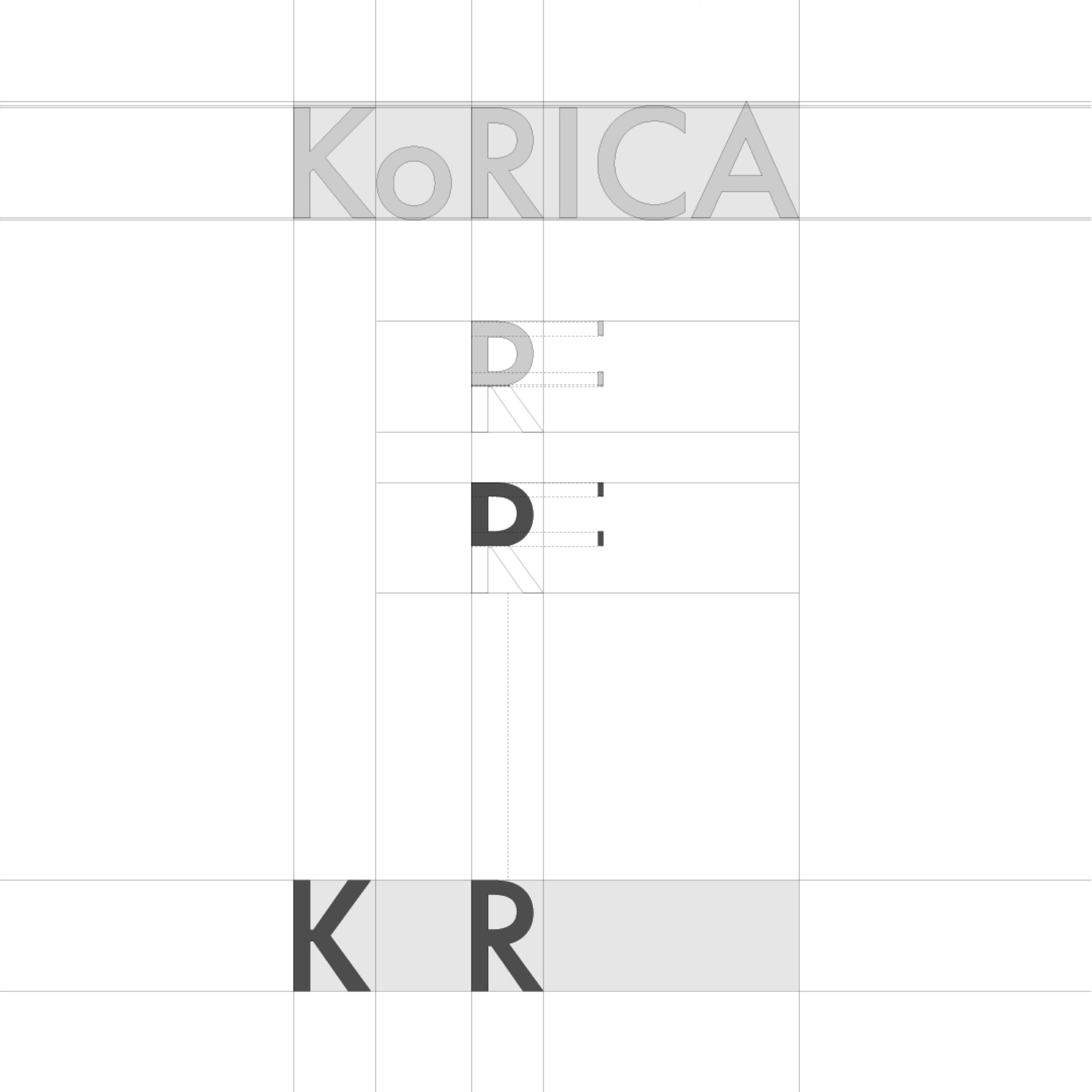
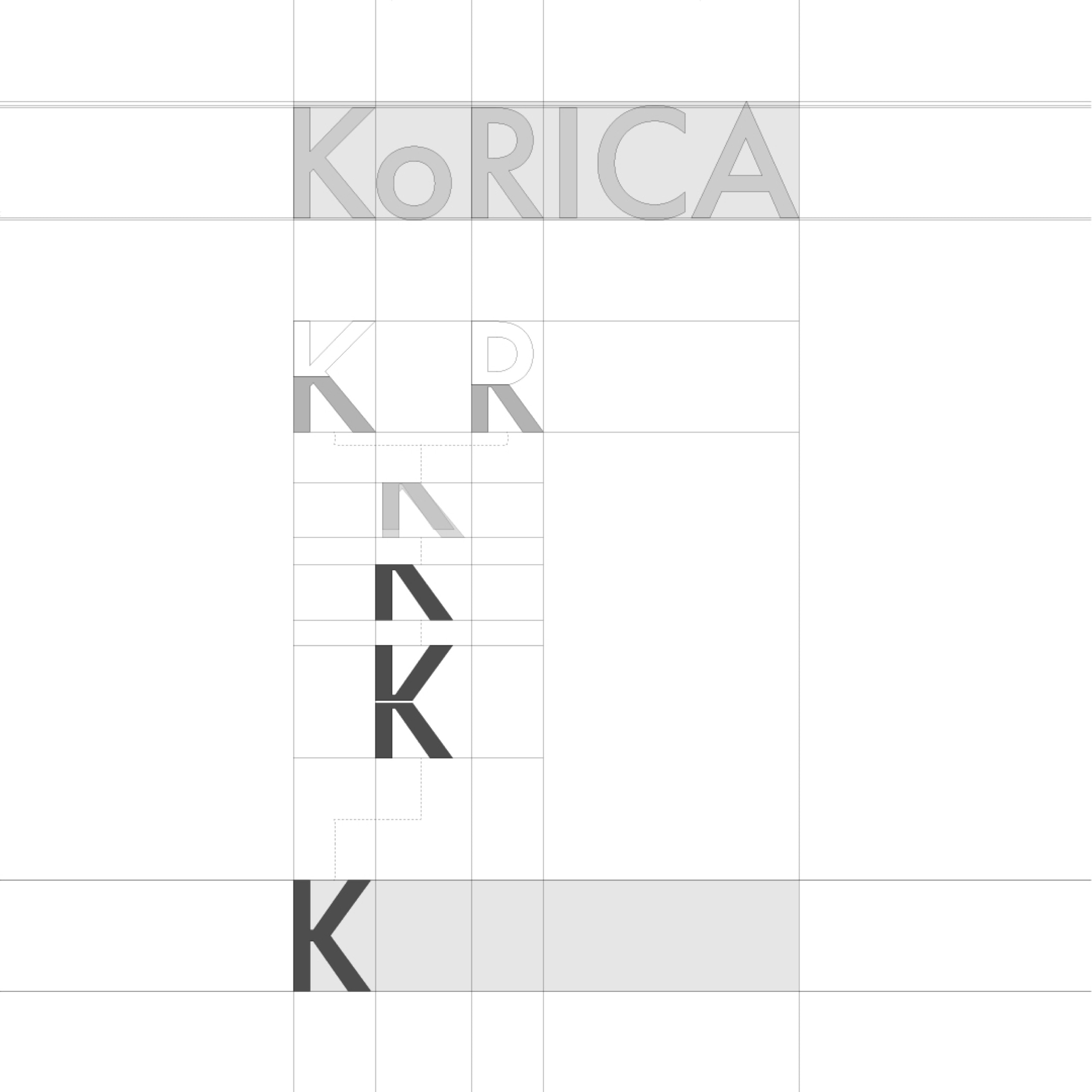
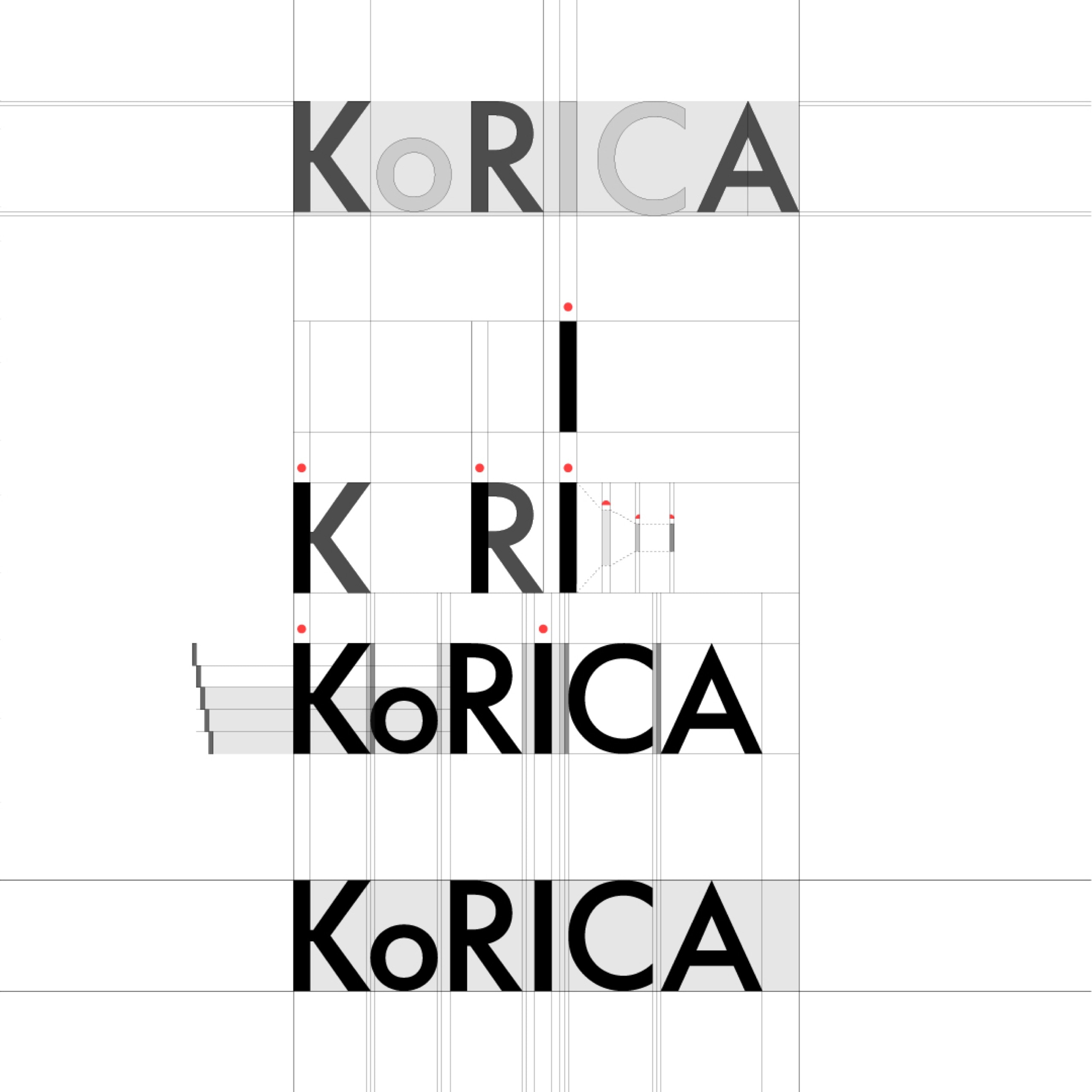
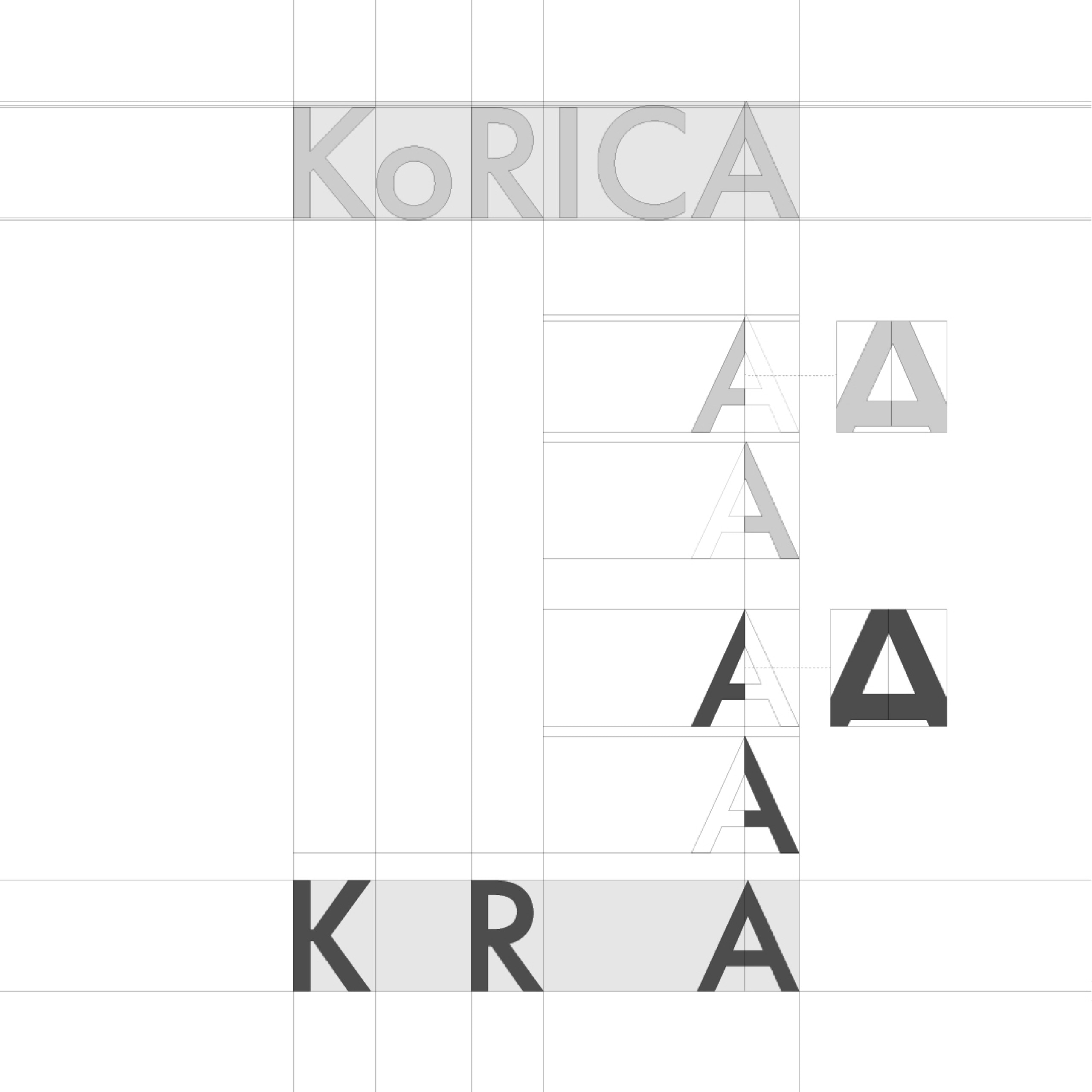
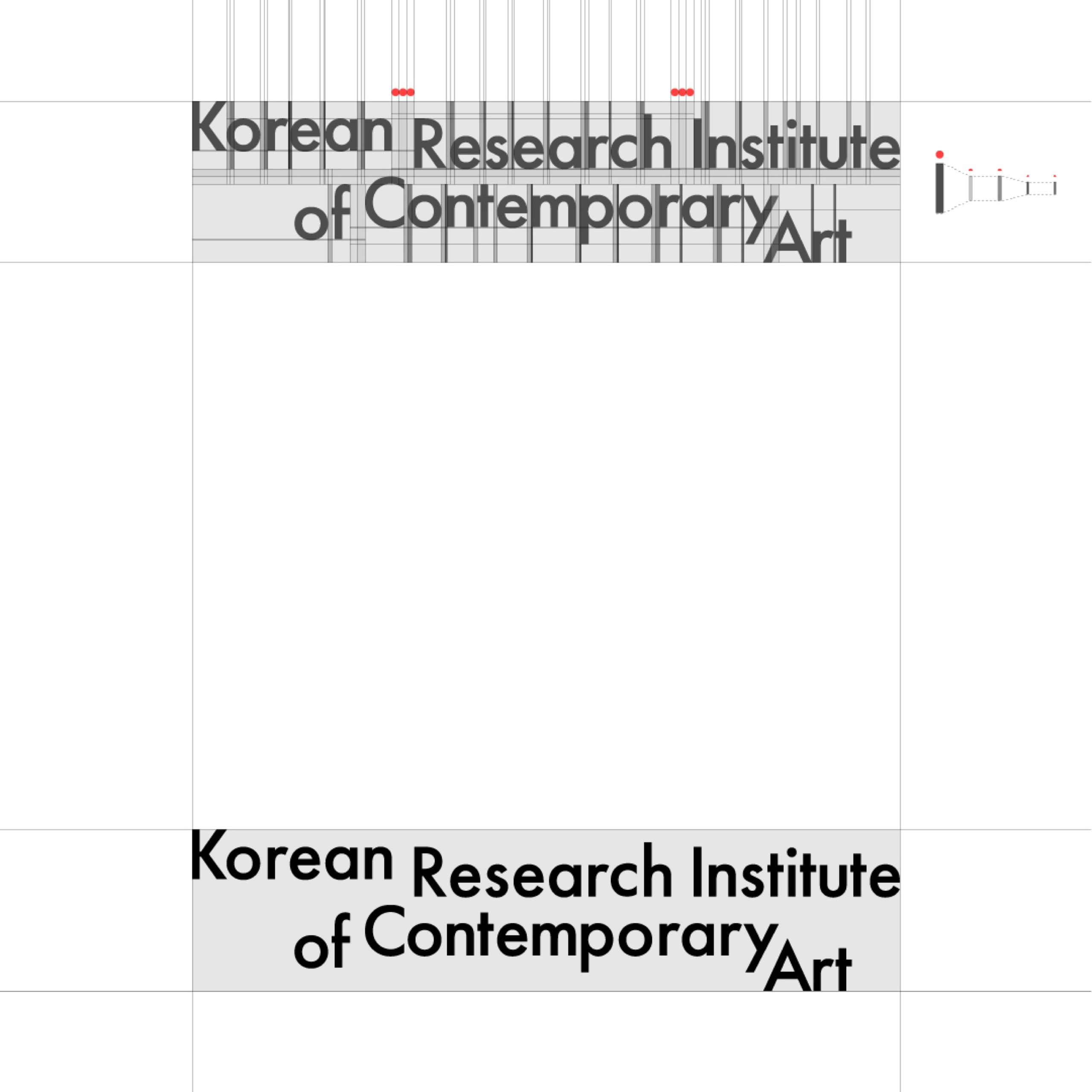
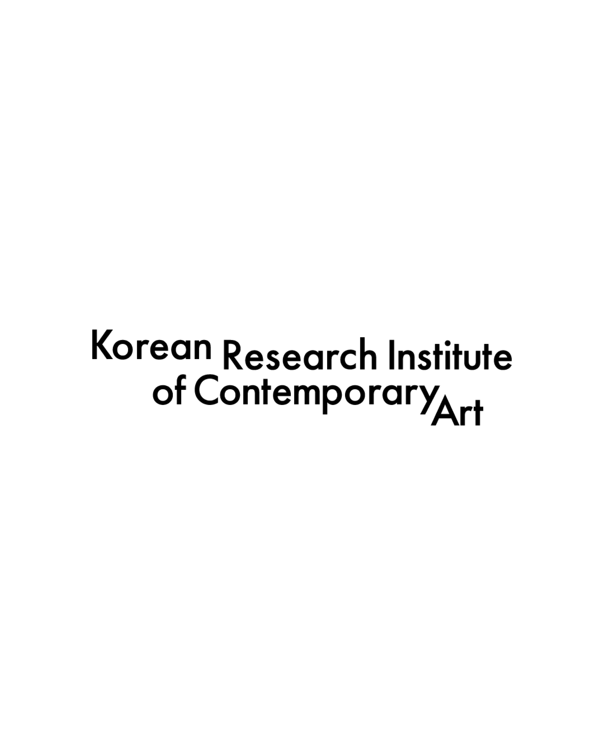
During the visualization process for the two word-type logo designs for KoRICA, I established two working standards: 1. It shouldn't be too static. 2. There should be a visual focal point among the letters. I thought Serif (Myeongjo) fonts could express a serious and trustworthy atmosphere, but they carried a heavy and somewhat stale vibe. While there was no disagreement that the foundation should have a serious and trustworthy visual language as its brand characteristic, I believed the most ideal brand form would express the concepts of connection and maximization dynamically while keeping the internally published content itself serious and reliable.
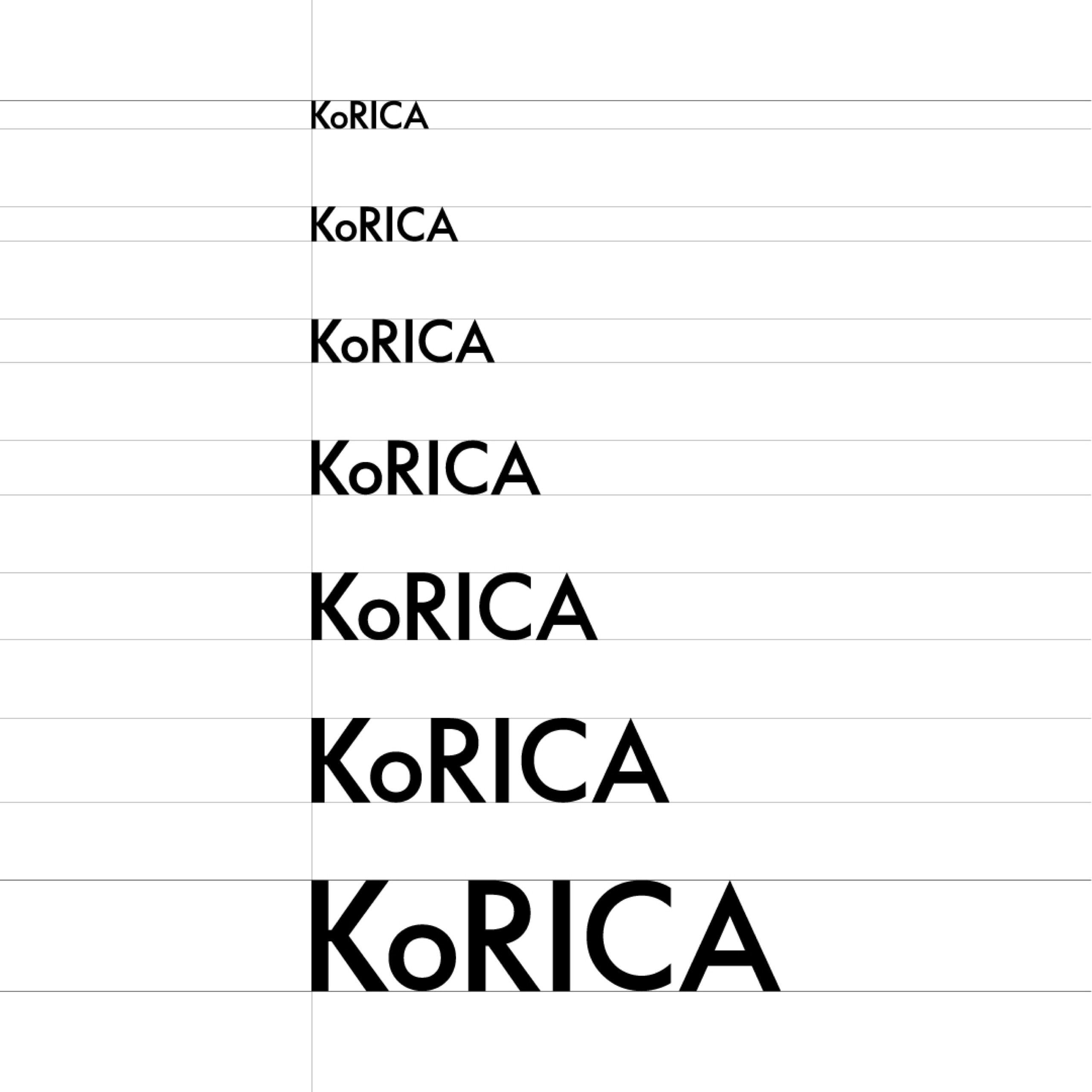
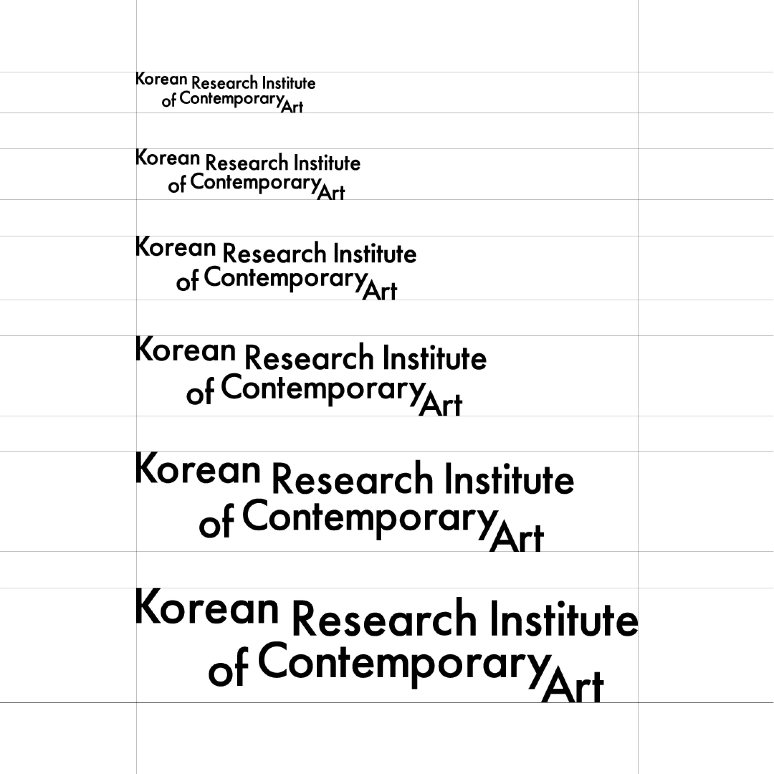
Therefore, I set a Sans-serif (Gothic) font as the default, and among them, I ultimately adopted <Futura>, which possesses more vitality and rhythm than other Sans-serif fonts. Also, I deemed it appropriate for the concept because it featured points among its letters like <A, t, u> that could be utilized as focal points.